

redBus
redBus
redBus
B2C, Internal Tools, 0 to 1, Startup
B2C, Internal Tools, 0 to 1, Startup
B2C, Internal Tools, 0 to 1, Startup


Overview
Overview
An extensive collection of work I did during my three years at redBus, the world's largest bus booking platform. During this time, I was responsible for designing the core redBus platform, creating internal tools and driver management systems, and leading the design for new verticals like BusHire.
An extensive collection of work I did during my three years at redBus, the world's largest bus booking platform. During this time, I was responsible for designing the core redBus platform, creating internal tools and driver management systems, and leading the design for new verticals like BusHire.
An extensive collection of work I did during my three years at redBus, the world's largest bus booking platform. During this time, I was responsible for designing the core redBus platform, creating internal tools and driver management systems, and leading the design for new verticals like BusHire.
Tools Used
Figma
Design Tool

Sketch
Design Tool
Tools Used

Figma
Design Tool

Sketch
Design Tool
Tools Used

Figma
Design Tool

Sketch
Design Tool
Tools Used

Figma
Design Tool

Sketch
Design Tool
Created
Created
2017 - 2019
Process
Process
Case study #1- redBus app
This case study focuses on a comprehensive redesign of the redBus app, aimed not at a visual overhaul, but at significantly improving the user experience based on extensive research, customer feedback, data analysis, and interviews. My primary focus was on redesigning the booking experience, with particular attention to the search results page and the bus details page—two key areas that are critical to the user journey.
The redesign was driven by insights gathered directly from our users, allowing us to address pain points and enhance the overall usability of the app. By refining these crucial pages, the goal was to streamline the booking process, making it more intuitive and user-friendly, ultimately leading to a more satisfying experience for millions of redBus customers.
Key Highlights
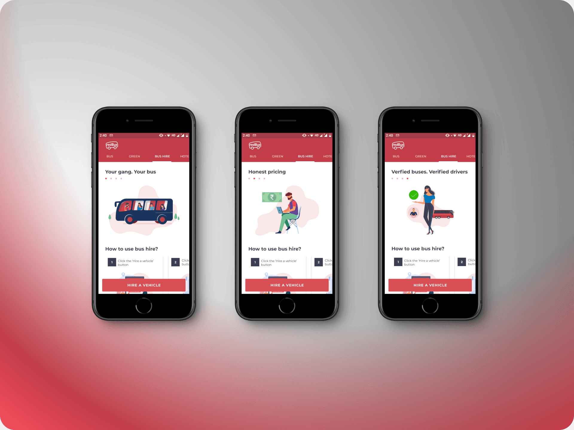
Onboarding explorations
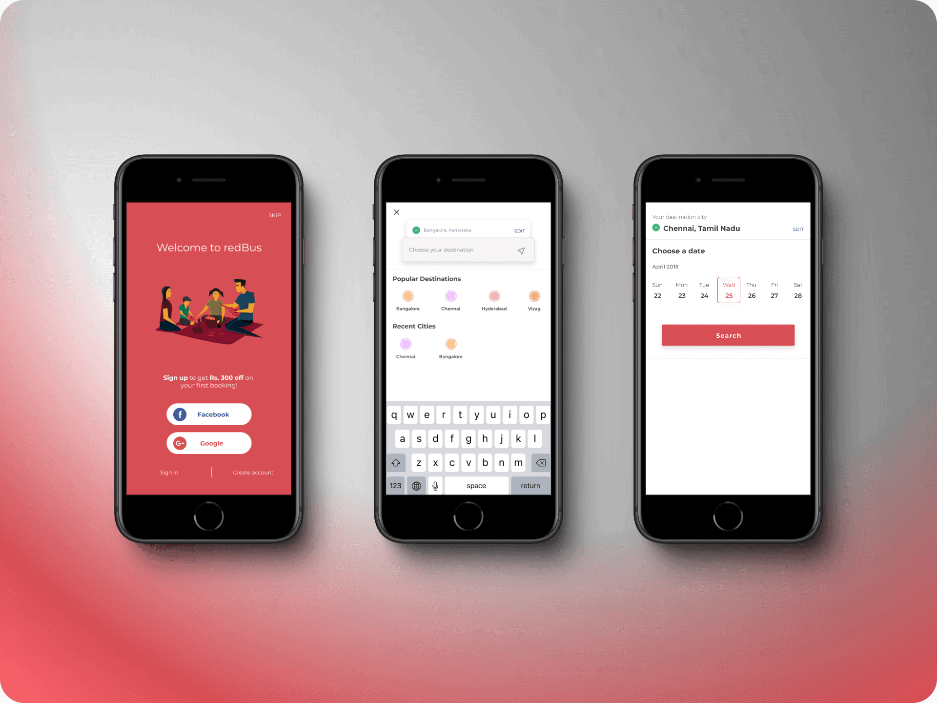
I delved into reimagining the app's onboarding experience, exploring how it could stand out and better engage users. Collaborating with talented illustrators, we envisioned a fresh visual direction for redBus. Here are some of the concepts we explored.
Search results
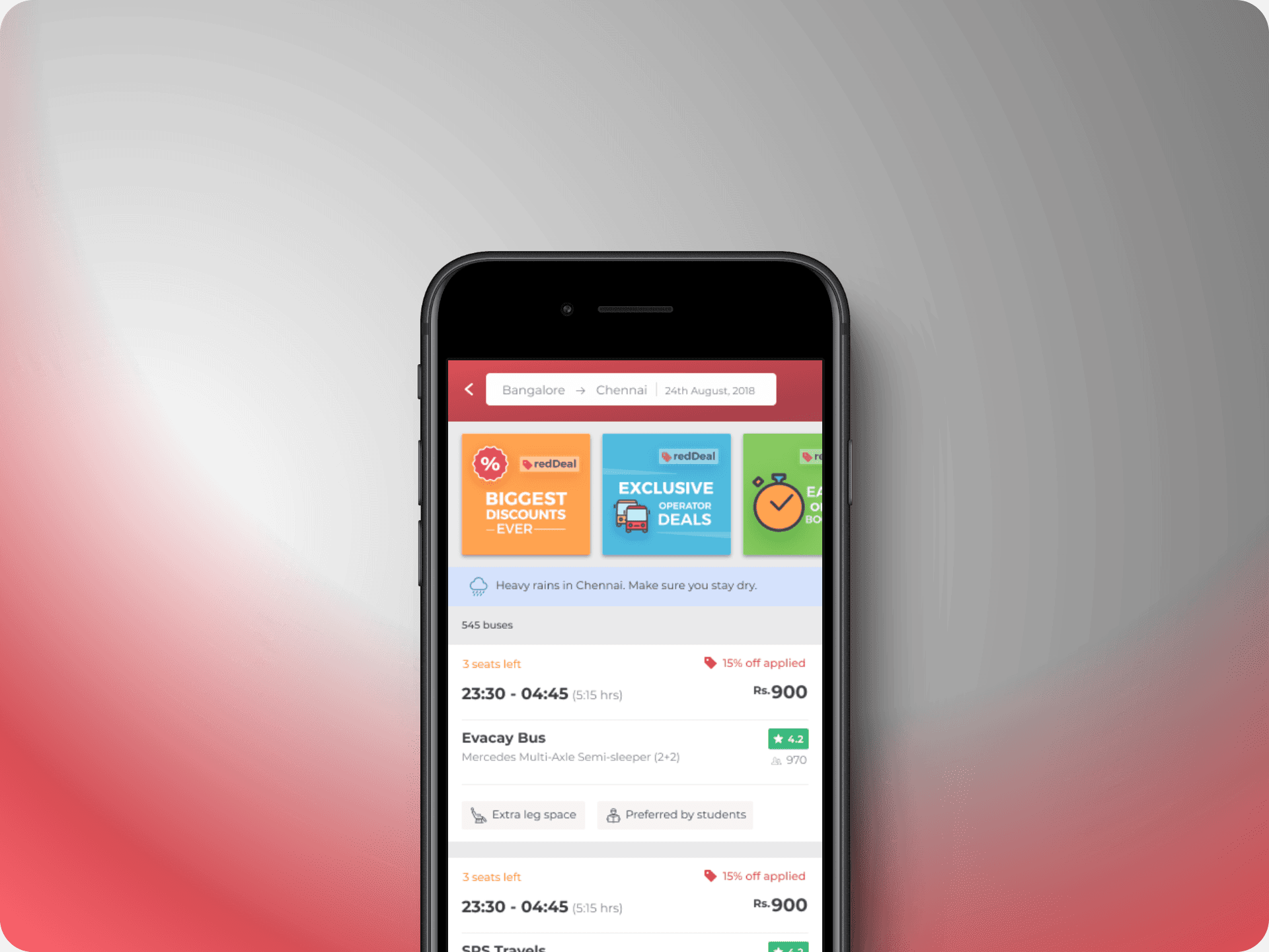
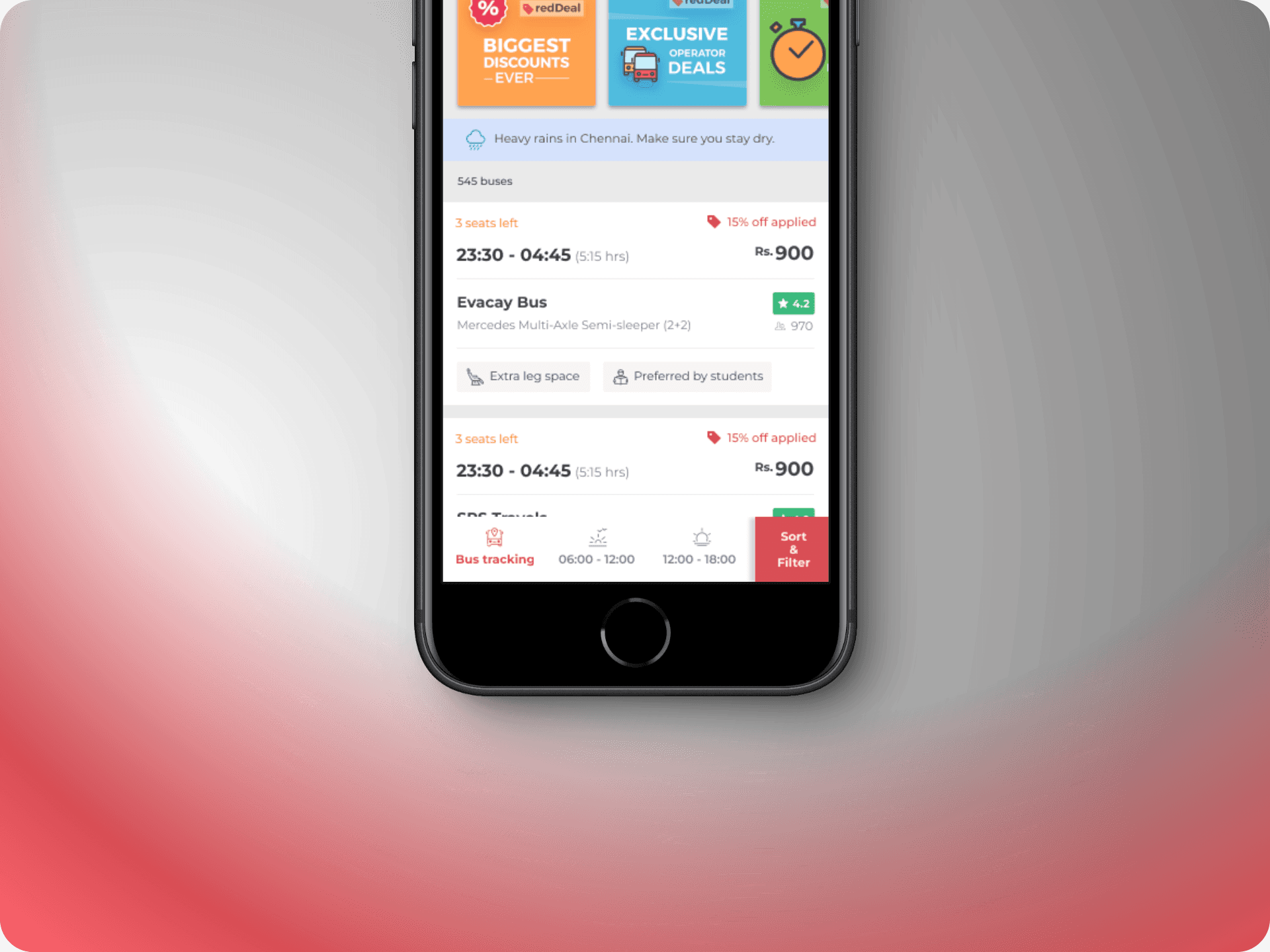
Redesigning the search results page presented a unique challenge: how to present all the essential information in a way that simplifies the decision-making process for users while also accommodating the needs of bus operators.
This redesign required a systems design approach to balance usability with the interests of bus operators, who each want to highlight their top features. The key was finding a way to integrate these elements seamlessly, ensuring the page remained user-friendly.
We introduced several enhancements, including a new "Offers" section, updated bus card elements, and improved filtering options. A significant innovation was the addition of persuasion tags. These tags, generated from data on city conditions, traffic, seasonal trends, and other key metrics, help guide users towards the most relevant and compelling options.
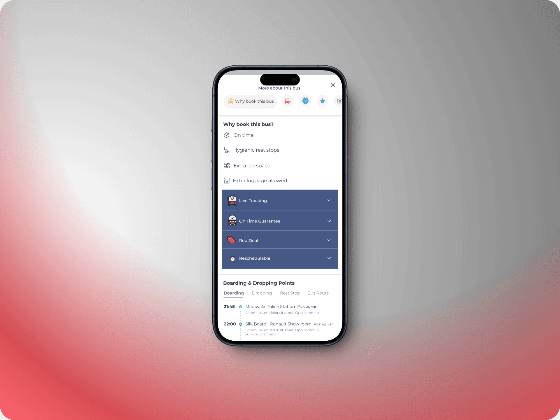
Bus Details
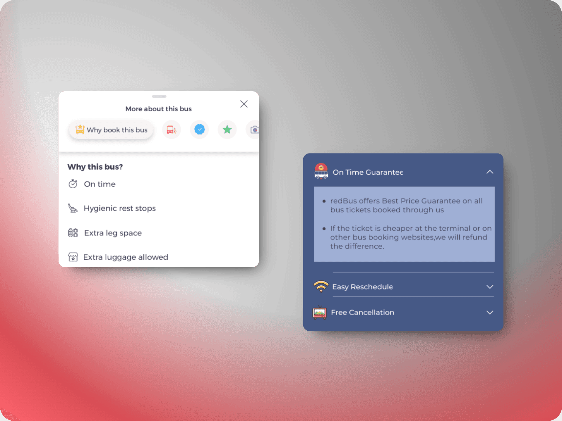
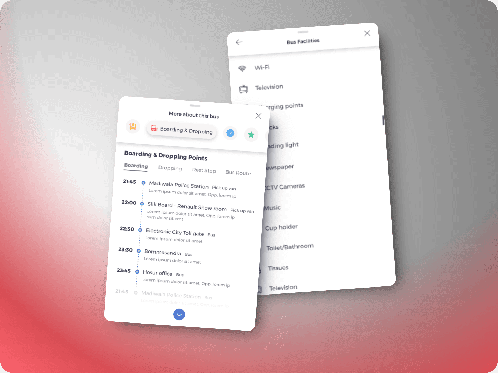
Providing comprehensive details about a bus was crucial, especially in a market like India where private transportation can vary significantly and users want assurance about their travel choices.
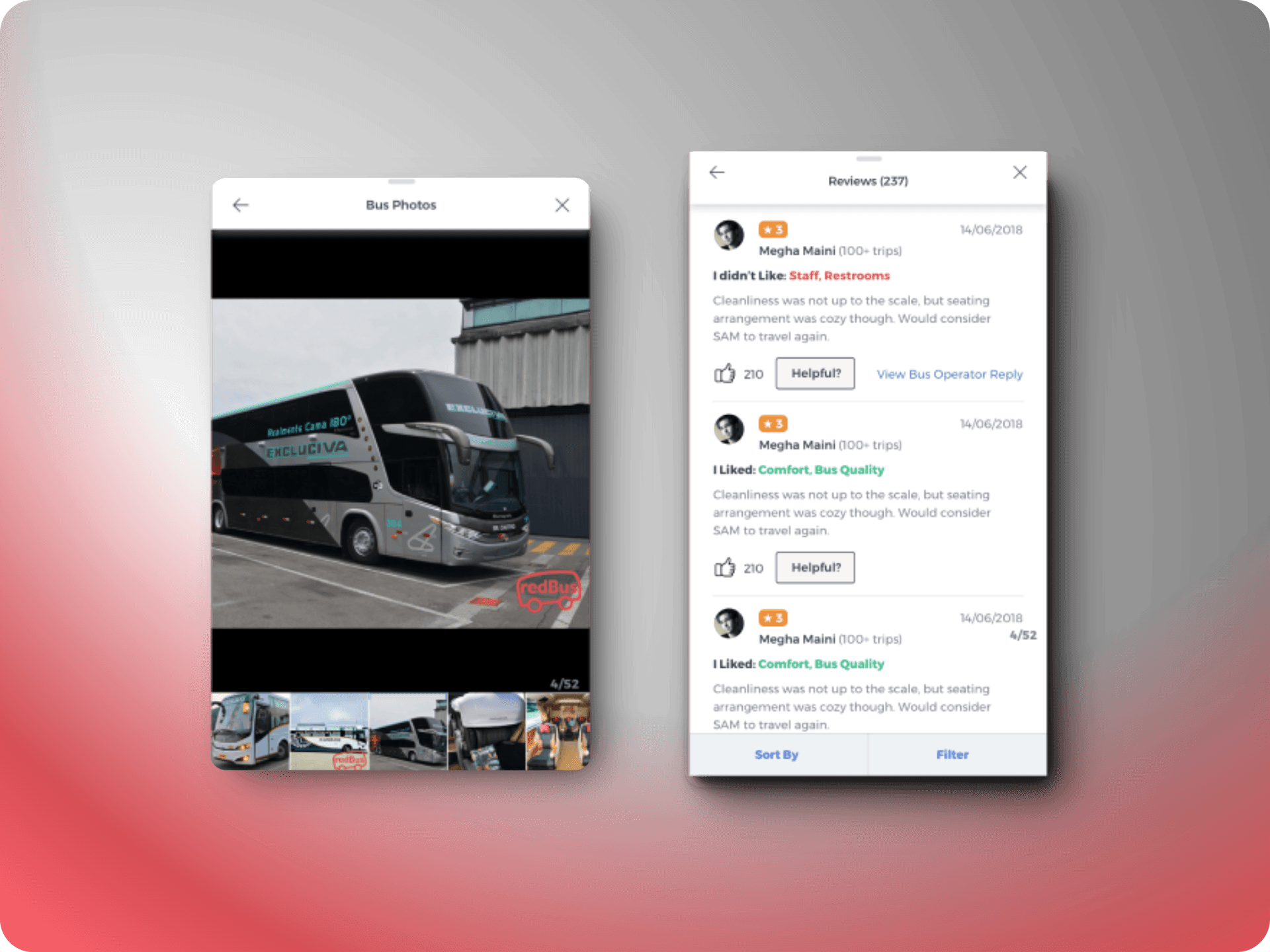
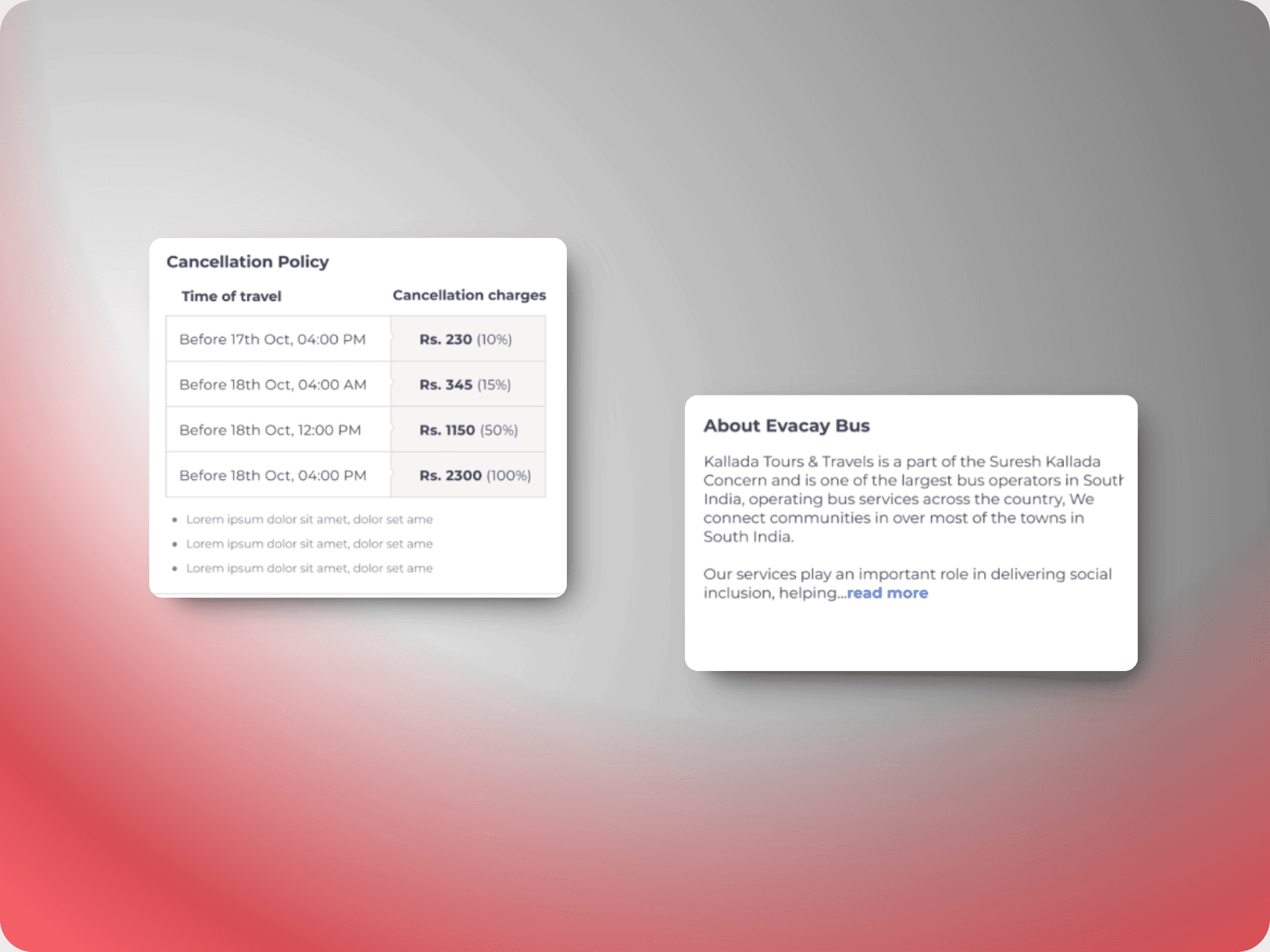
The redesigned bus details page aimed to address these needs by offering in-depth information about each bus operator and highlighting the unique features of their services. This page was crafted to not only showcase the operator’s specialties but also to transparently display the bus’s quality. Key elements included user-generated content such as ratings and reviews, along with high-quality images of the bus. This approach helps users make informed decisions and feel confident about their travel experience.
Case study #2- Bus:Hire
The introduction of the Bus Hire vertical marked redBus's expansion into a new market, aiming to digitize and streamline the process of renting buses for group travel. Traditionally, this market in India has been managed offline, with bus operators and travel agents negotiating quotes based on individual needs, involving extensive bargaining and trust-building, such as verifying driver details.
The challenge was to transition this complex, non-linear process into a digital platform. We designed a seamless experience that covers everything from the initial search to receiving quotes and paying in multiple installments. This digital solution represented a significant shift for the market, combining convenience and transparency in a space that had long relied on face-to-face interactions. The result was a unique and innovative approach to bus rental, addressing the specific needs and expectations of the users while modernizing the booking process.
Key Highlights
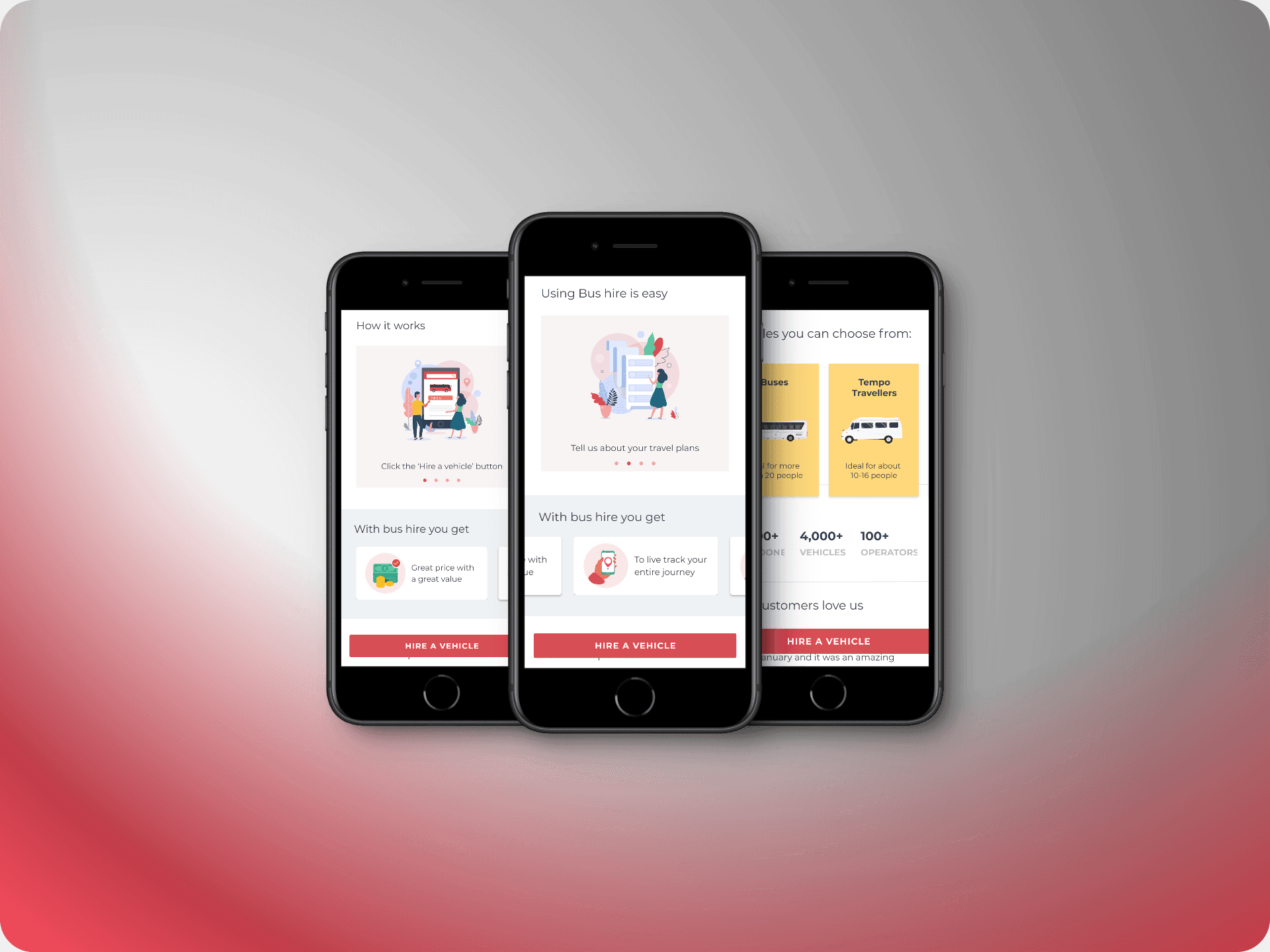
Homepage
Unlike redBus, the BusHire vertical was a newer concept and initially relied on a basic lead generation form to gather user inquiries for quotations. To better educate users about this new service, I redesigned the homepage into a detailed, long-scroll format. This new design breaks down each feature, providing comprehensive information to guide users through the BusHire experience and help them understand the value of the service.
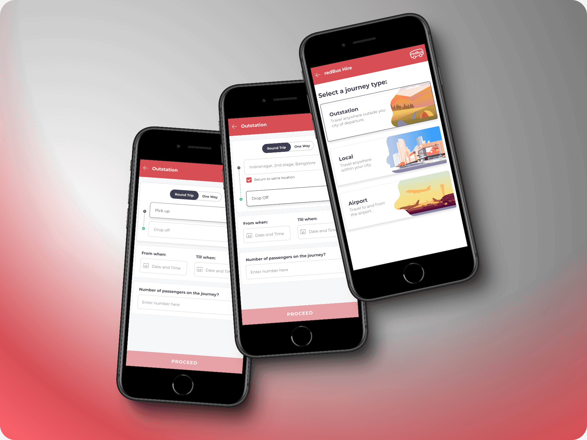
Search
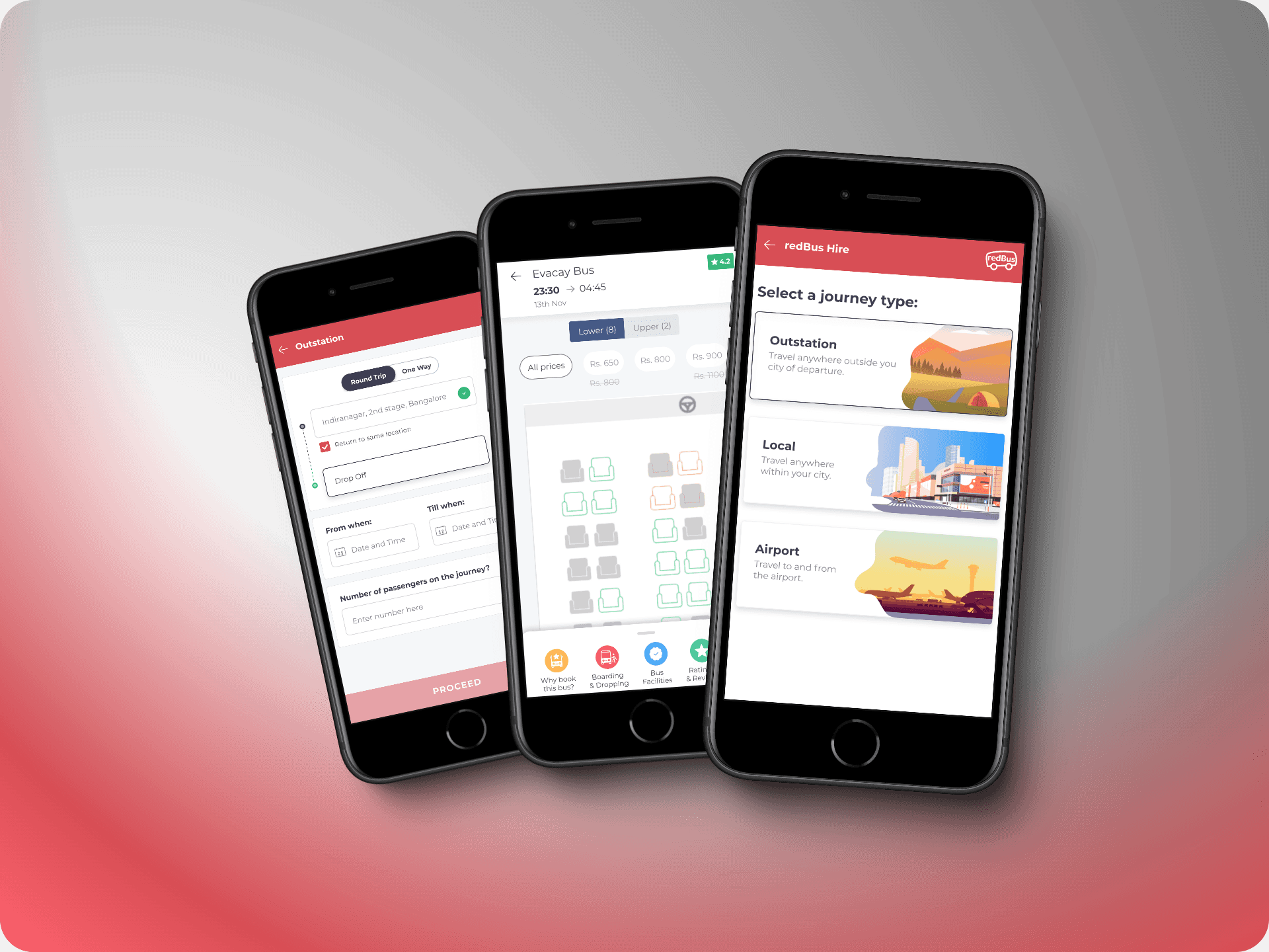
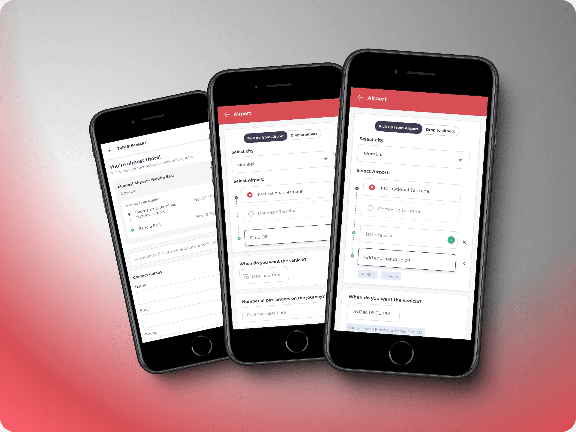
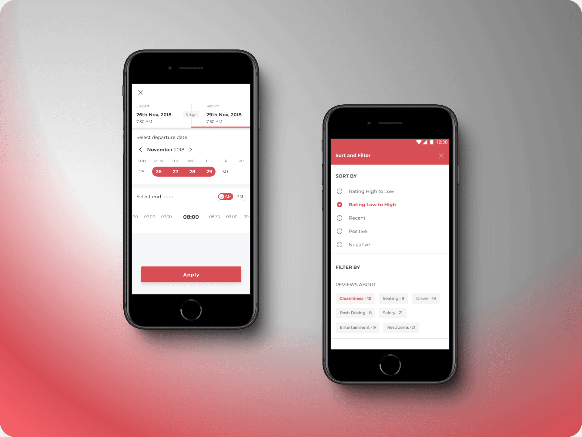
The search form for BusHire needed to inspire trust while addressing the common questions users typically ask bus operators. It was essential to capture the nuances of real-life conversations, answering questions like:
- Will the bus drop me back to my location?
- Can I pick up a friend on the way?
- Can different people be dropped off at different locations?
- What time will we reach, and how long will it take?
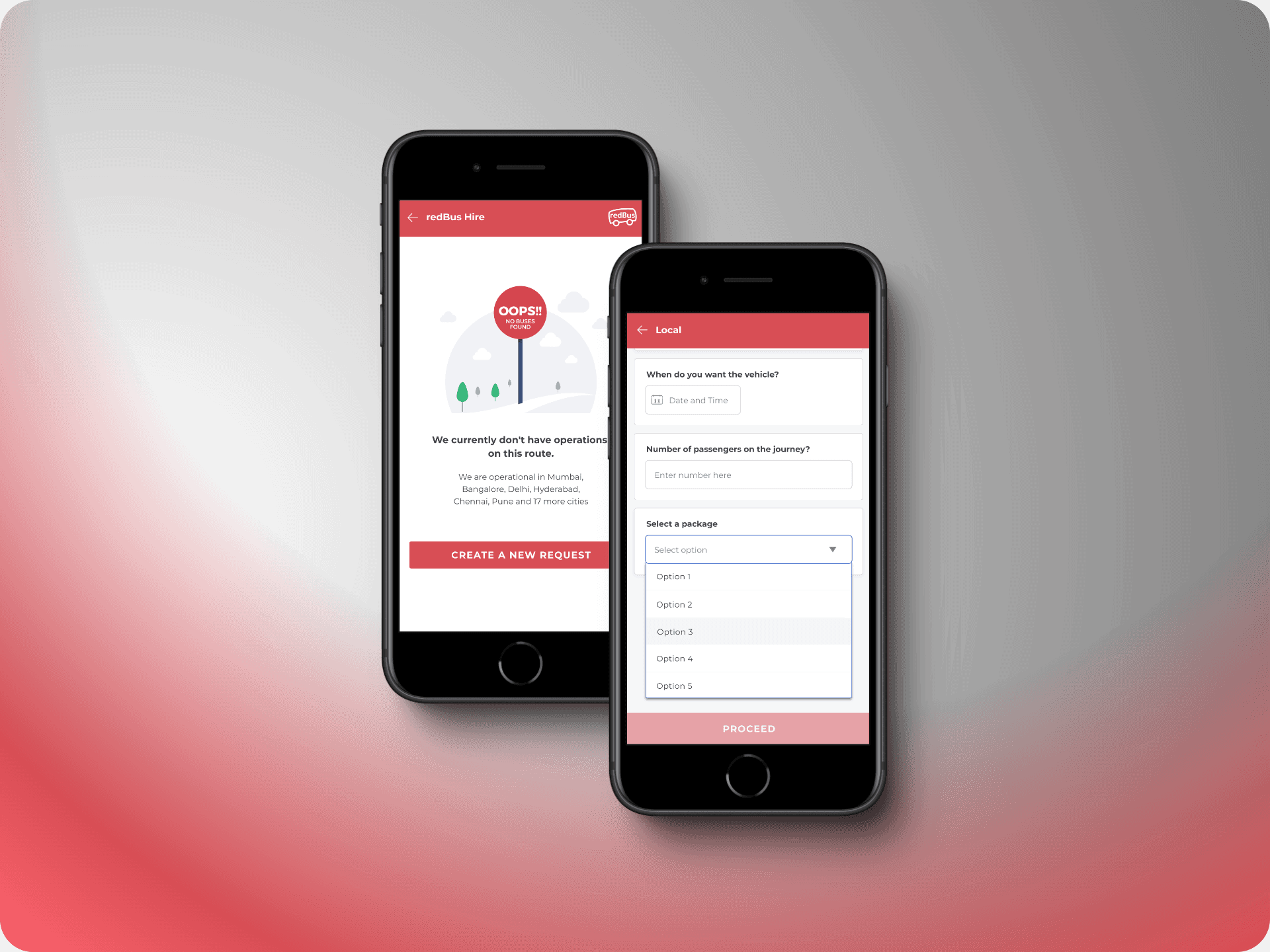
Additionally, the form had to accommodate various scenarios, such as outstation trips, local rentals, and airport transfers—each with its own unique set of challenges. For airport rentals, a critical feature was identifying the correct drop-off terminal, as many Indian airports have separate and distant terminals for international and domestic flights.
Search Results
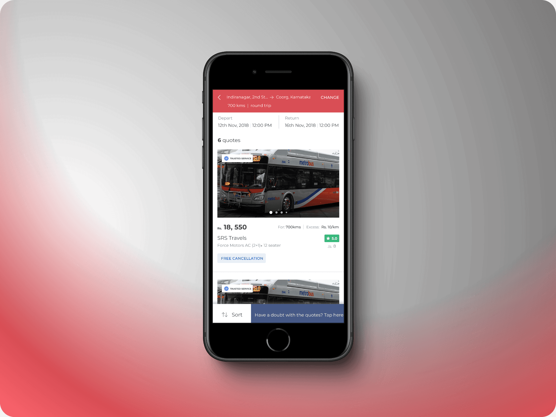
Previously, customers would receive an overwhelming average of 10 quotes. The redesigned search results page streamlined this by limiting the display to the top 4 or 5 options, making decision-making much simpler. Key enhancements in the new design included:
- A ‘Trusted Service’ badge for verified bus operators.
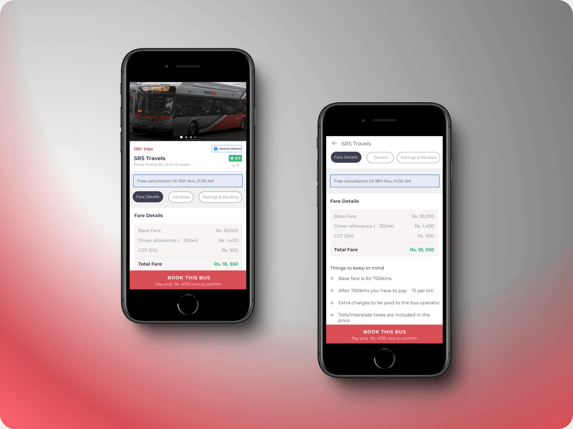
- Upfront fare details with a detailed cost breakdown.
- A ‘Things to Keep in Mind’ section, which was previously buried in the terms and conditions.
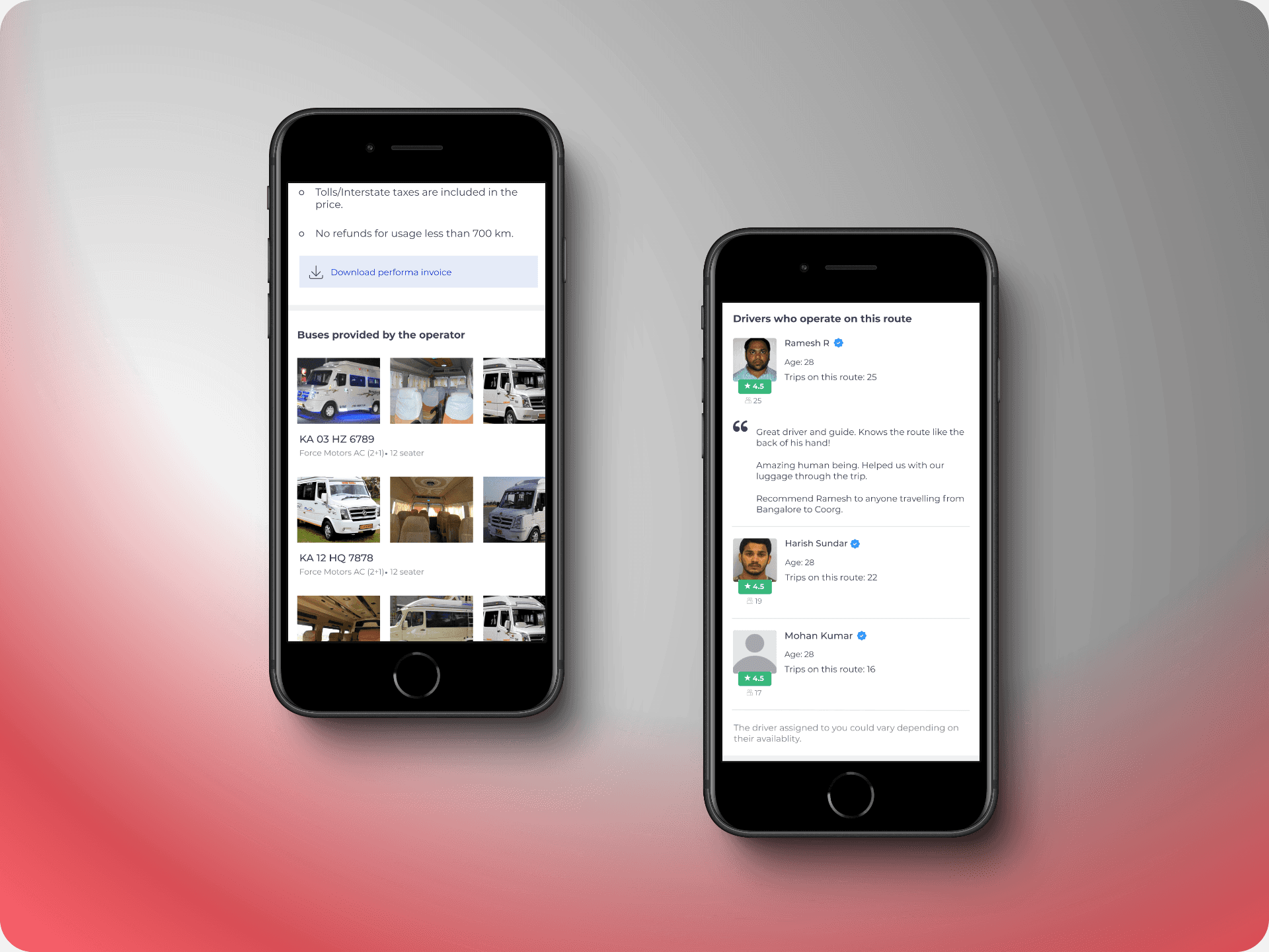
- A new section displaying all buses assigned to the quote by the operator.
- Information about the drivers assigned to the route, including reviews, age, trip history, and languages spoken.
Additionally, the quotation page retained essential elements like ratings, reviews, and cancellation policies from my earlier redesign of the redBus app, ensuring a consistent and user-friendly experience.

Payment
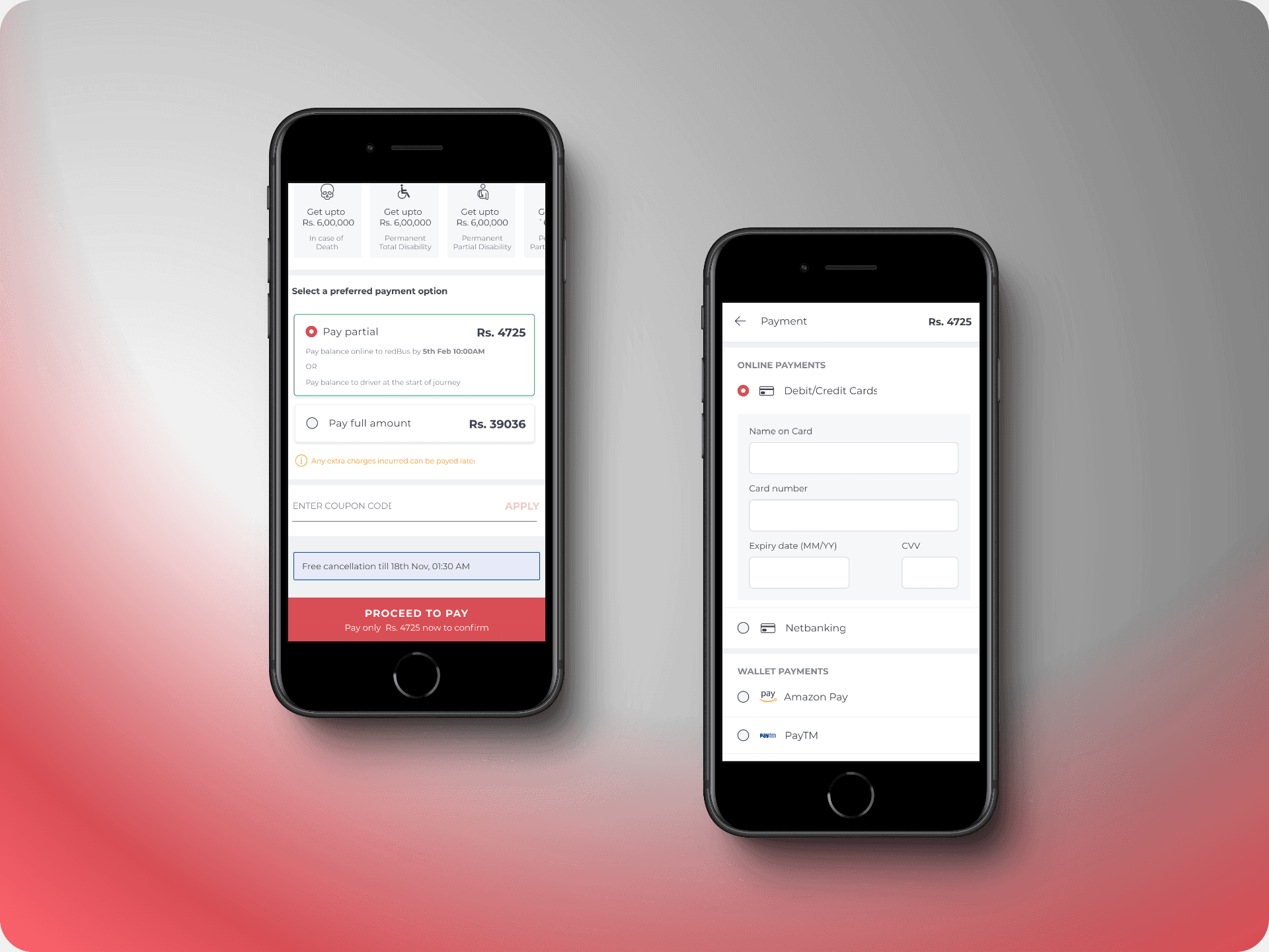
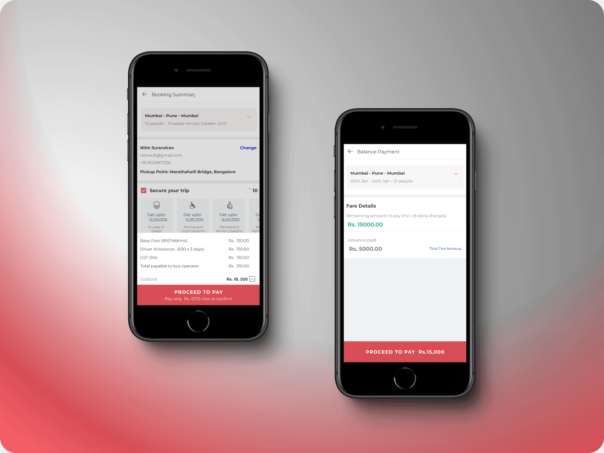
The booking flow for BusHire introduced a crucial feature not found in the redBus app: the option to pay a partial amount upfront or settle the full payment at once. This addition was a direct response to user feedback gathered during our research, addressing the specific needs of customers who preferred flexible payment options for their bookings.

Case Study #3- Desktop Booking Experience
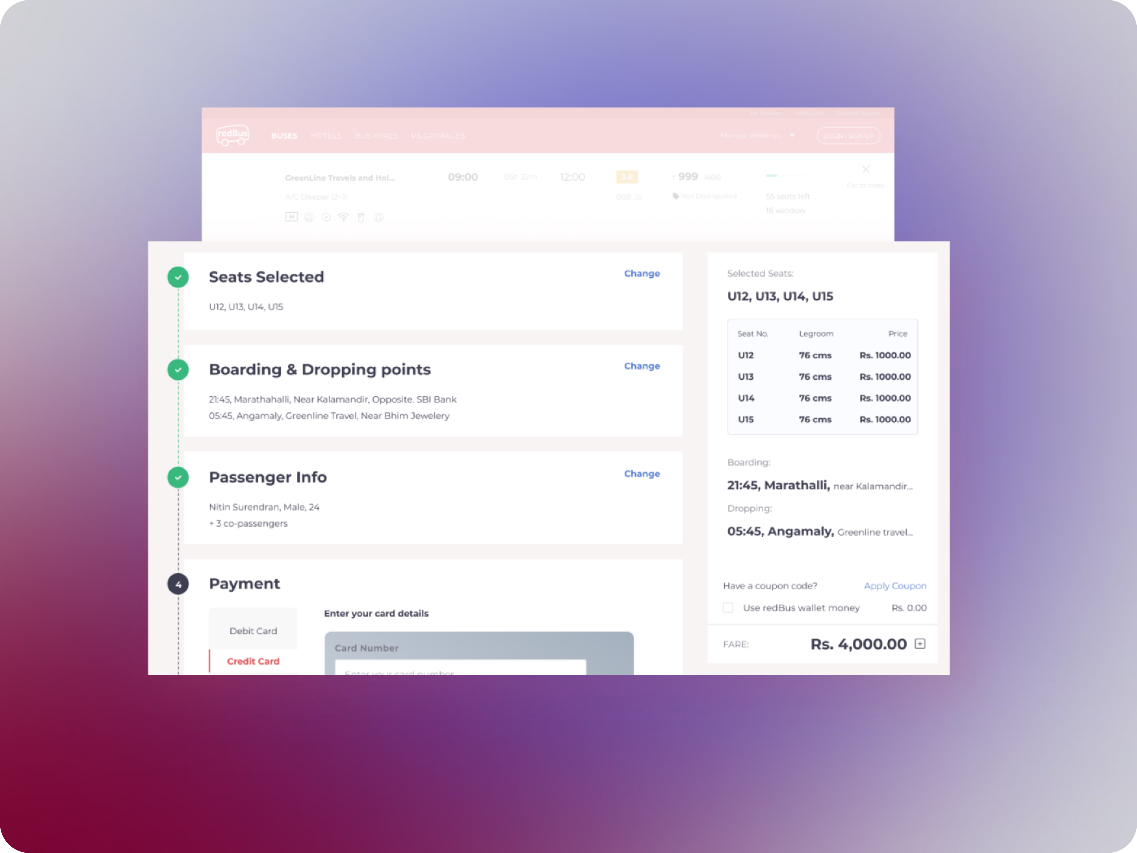
This case study highlights my role in redesigning the booking experience for redBus. Tasked with improving the user experience across multiple geographies, including India, Singapore, Malaysia, Peru, and Colombia, I was responsible for designing the complete user flow—from search to seat selection to booking—for 23 million active users worldwide.
Lacking a dedicated user research team, I relied on a combination of self-directed research and insights gathered from product managers who worked closely with local teams in Southeast Asia and Latin America. My research approach, while unconventional, involved analyzing a range of sources, from cultural content to firsthand accounts, to develop a user-centered design strategy.
Key Highlights
Ease of Access:
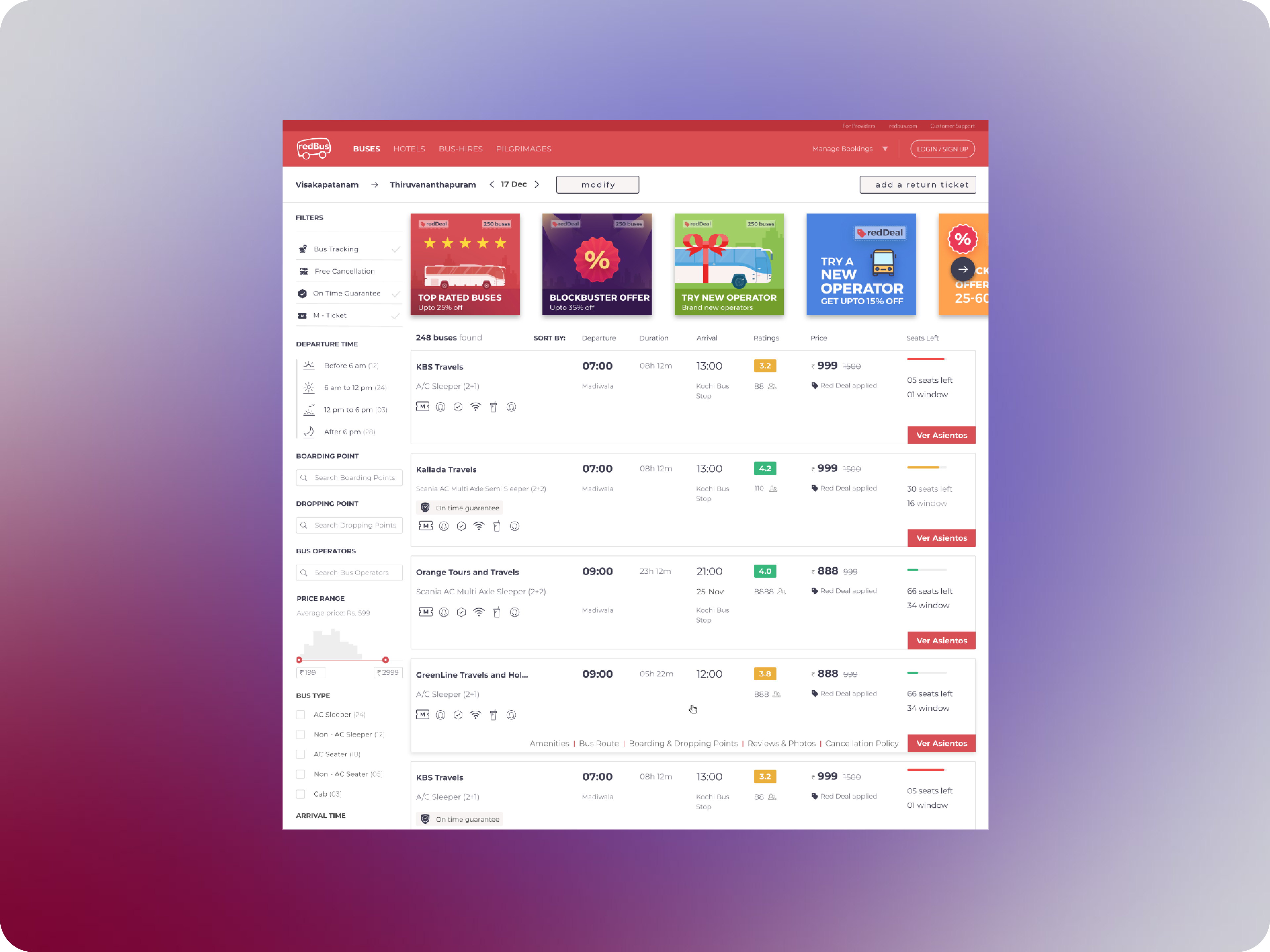
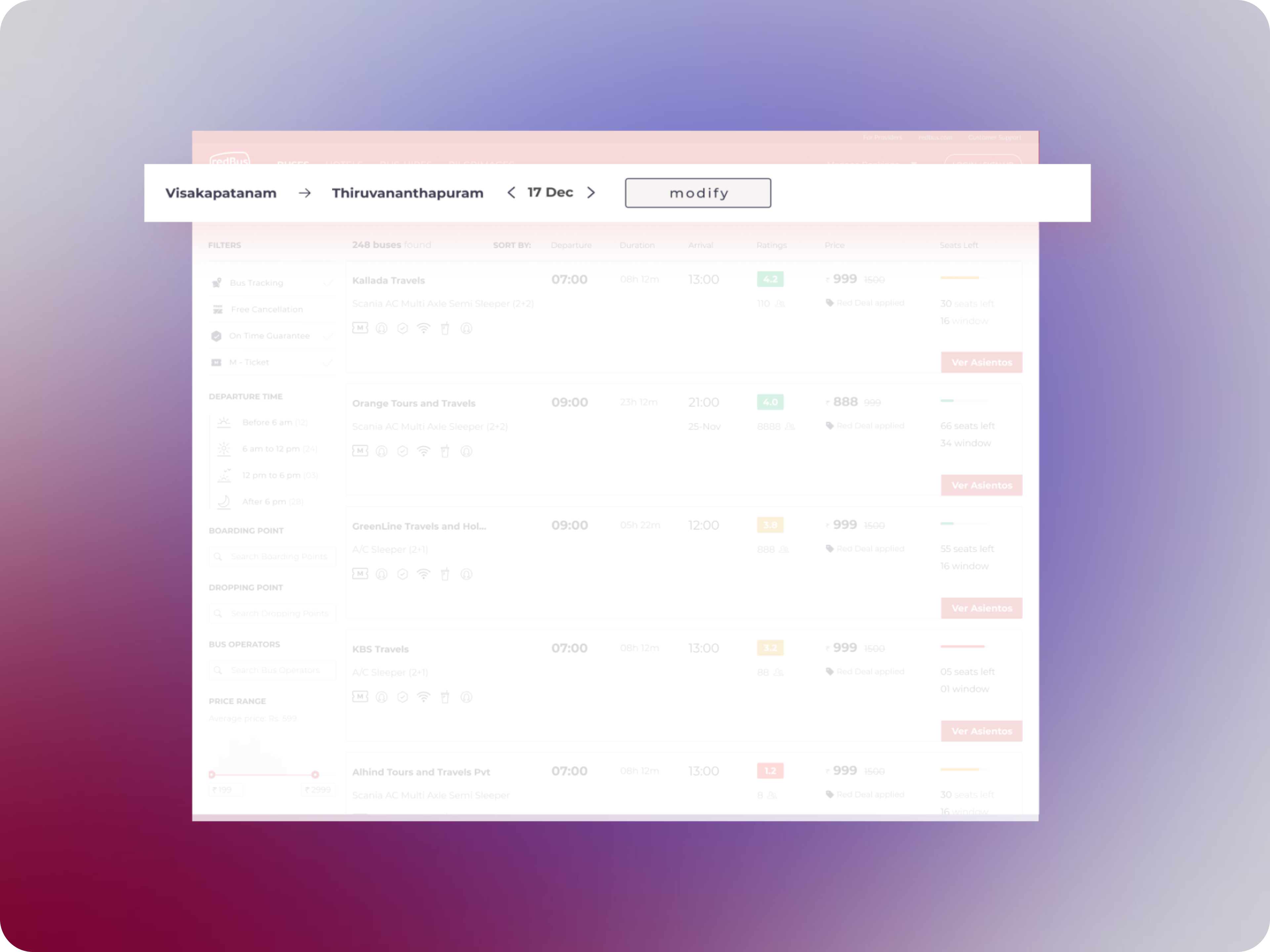
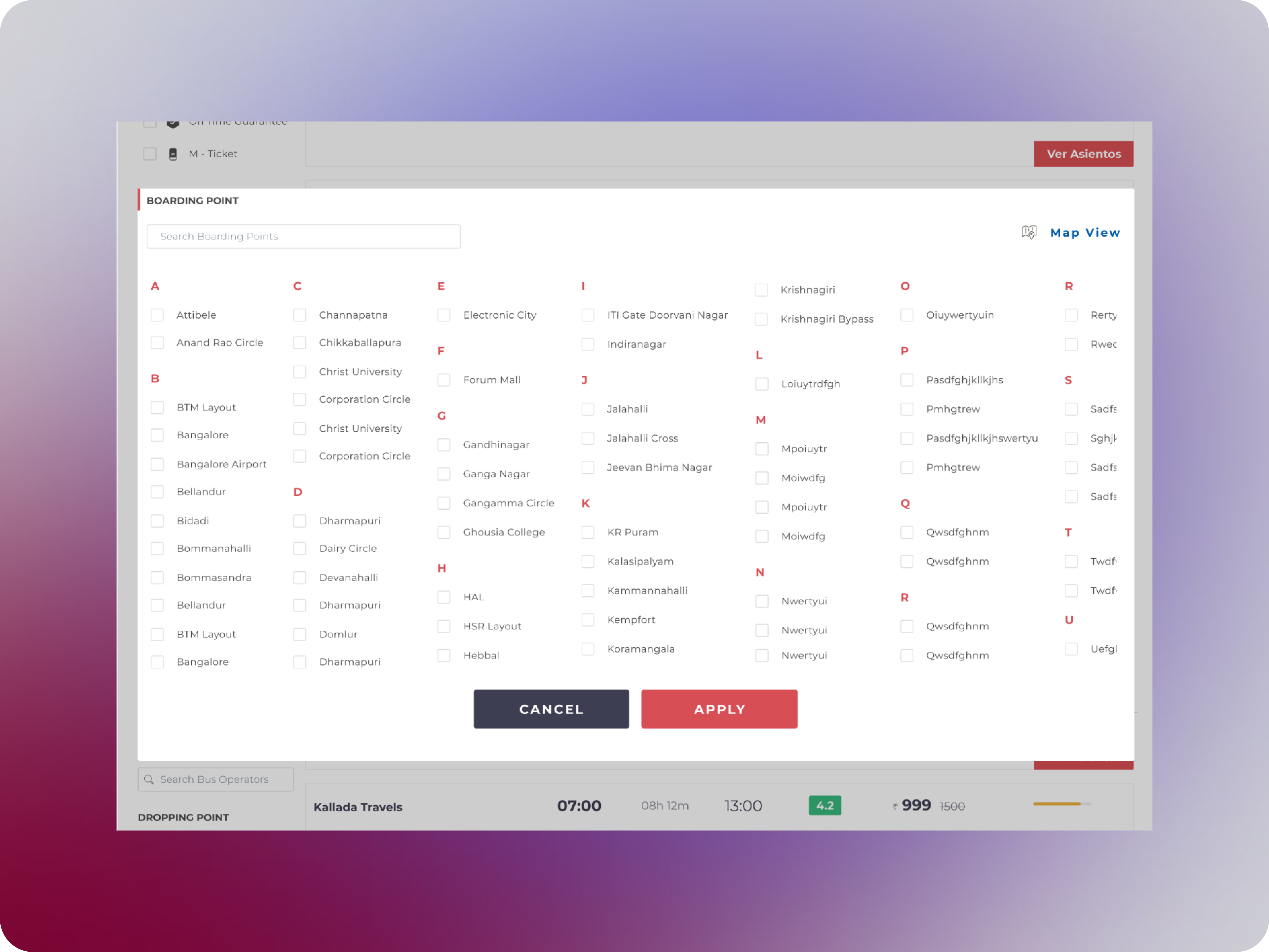
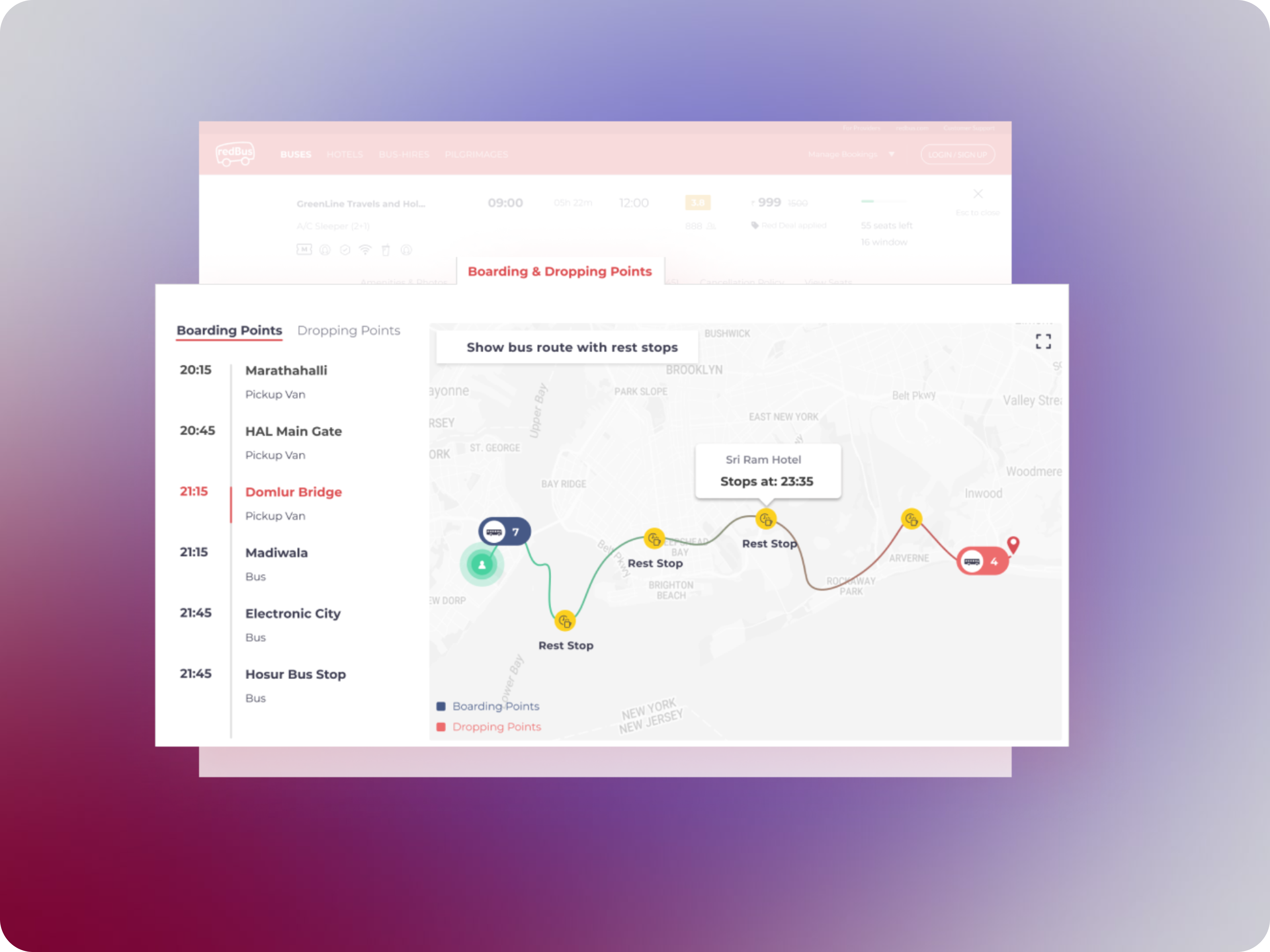
Users could now edit their boarding and drop-off points directly within the booking flow, without the need to return to the home page. This feature was particularly important for a country like India, where each route often has numerous pick-up and drop-off locations. It streamlined the selection process, making it easier for users to find and choose the most convenient options.
Reforming Behaviours
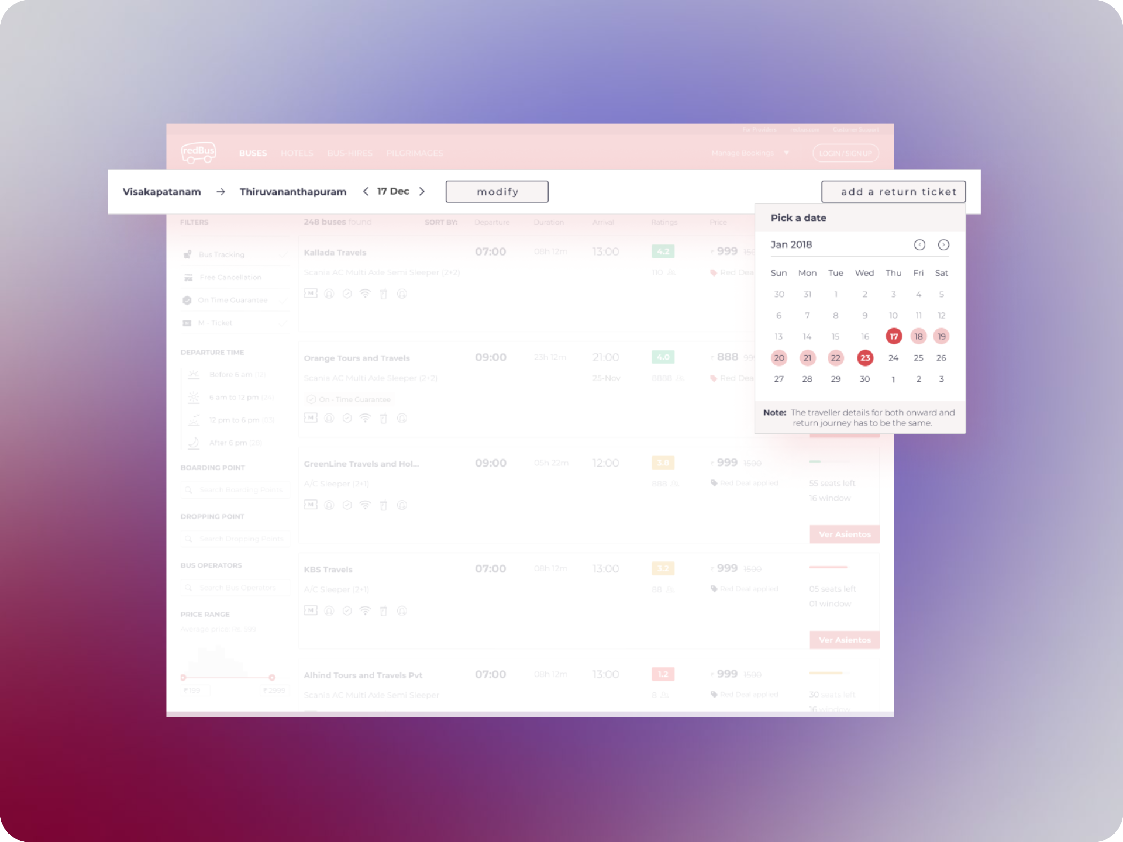
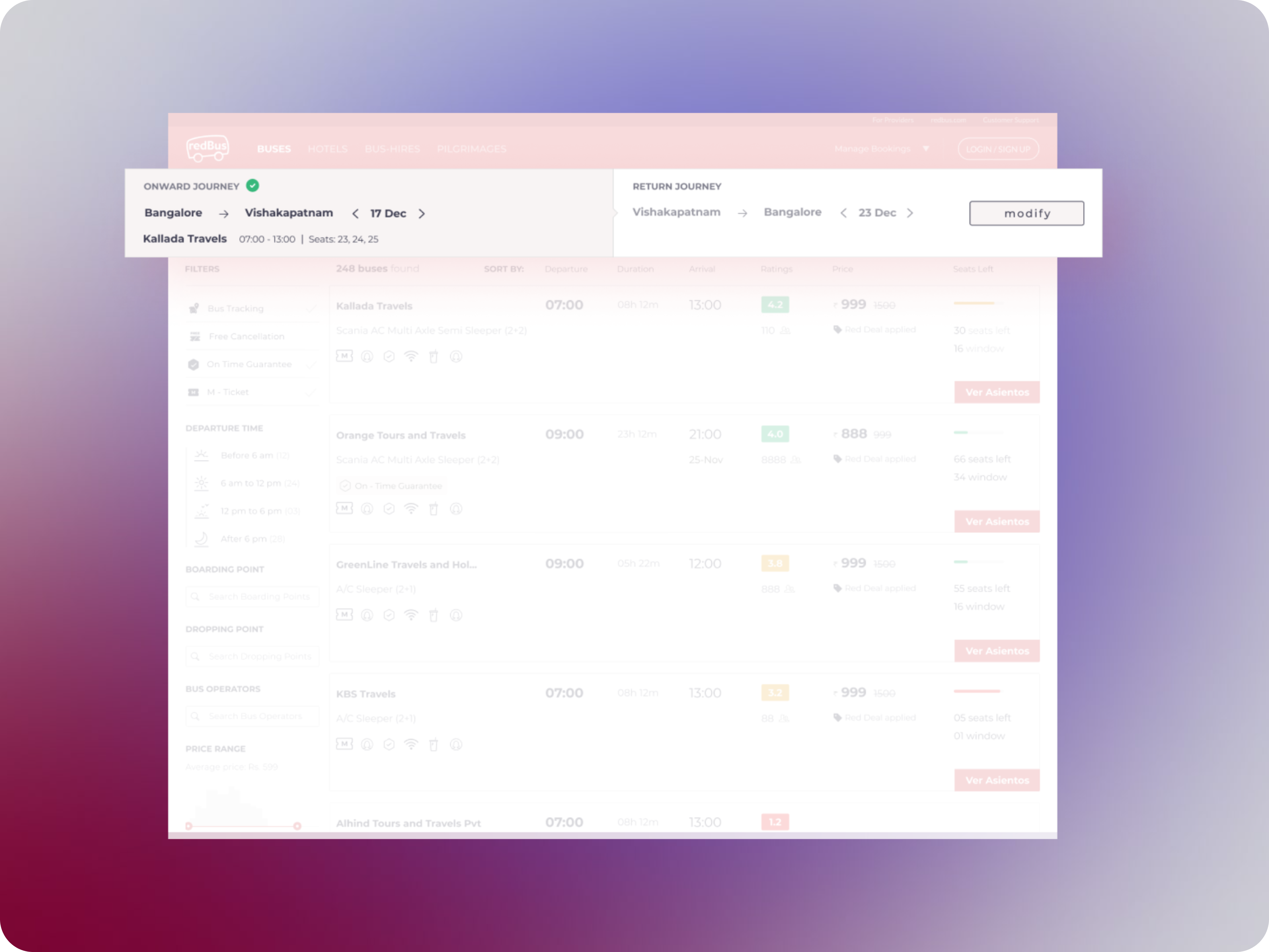
Users no longer needed to repeat the entire search and booking process for a return journey. The "Add a Return Ticket" feature streamlined the experience, allowing users to book both their outbound and return trips simultaneously, saving time and making the process more efficient.
Reducing Cognitive Load
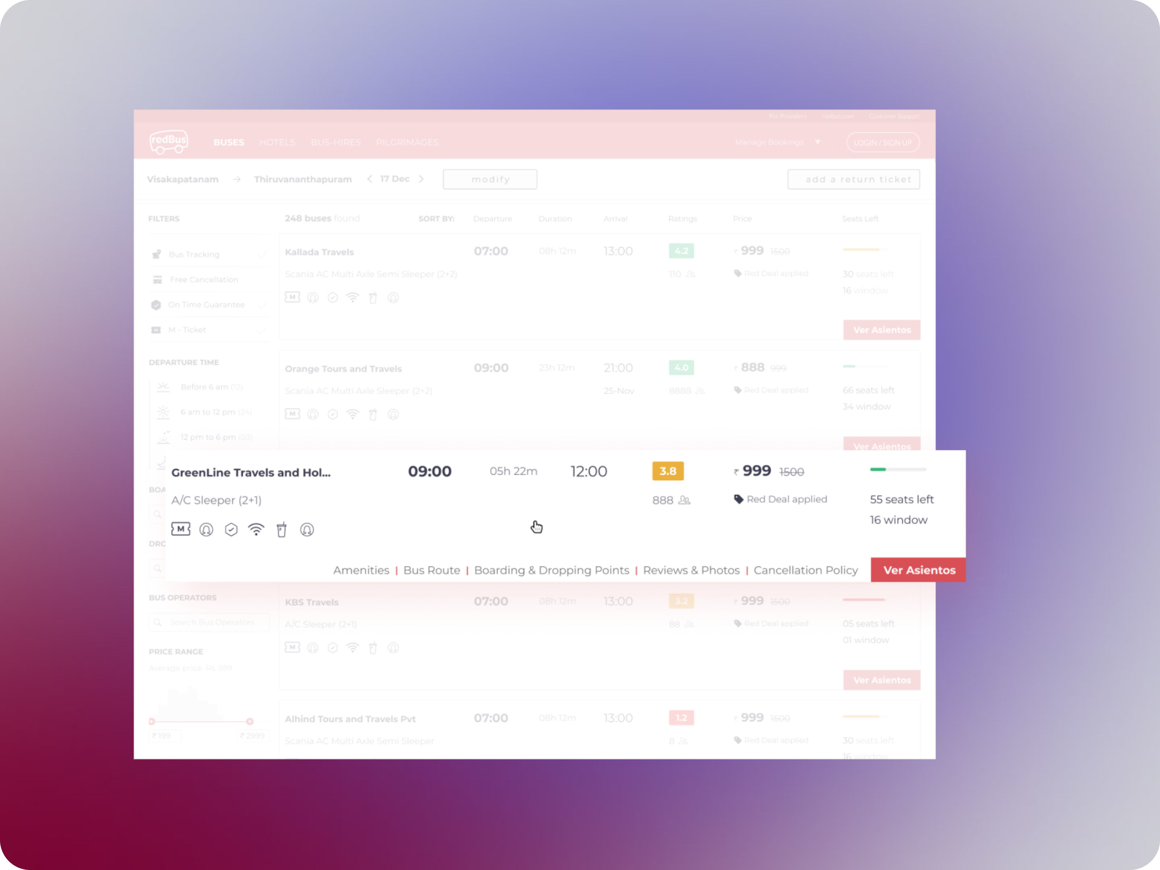
Data showed that users primarily focused on price, rating, and timings when booking a bus. To simplify the decision-making process, secondary details were hidden and only revealed on hover, allowing users to concentrate on the most important factors without being overwhelmed by information.
Streamlined Filtering for Faster Decisions
Previously tucked away under a tab, filters were brought to the forefront on the main page. This change led to a 17% increase in filter usage, enabling users to narrow down their options and make decisions more quickly and efficiently.

Some other key screens
Case Study #4- Bus Driver app
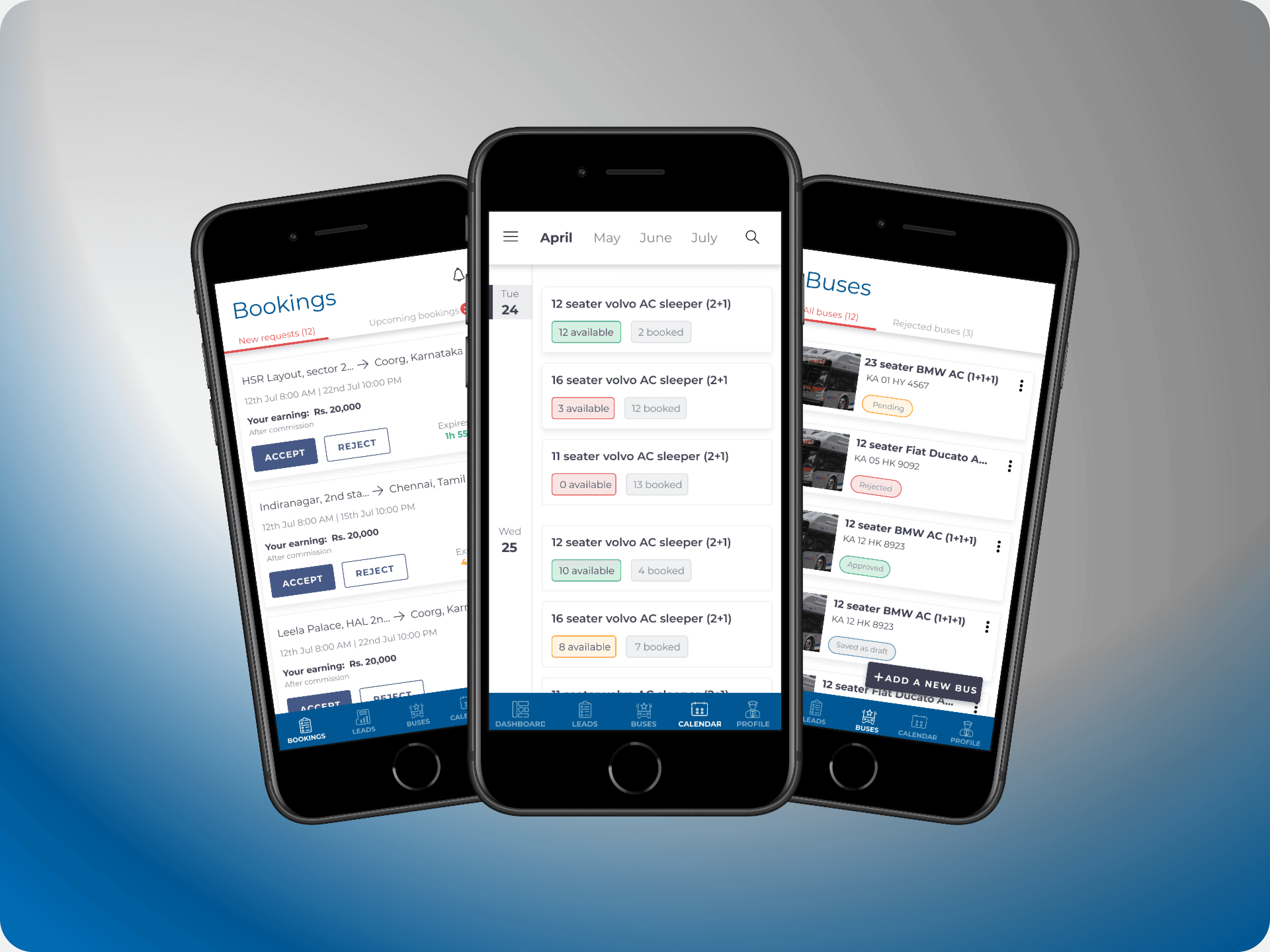
The redPro Hire app was developed to provide an efficient mobile solution for drivers and bus owners engaged with bookings, payments, and cancellations. Initially a desktop-only platform, the need for a mobile app became evident to facilitate on-the-go task management.
The app offers a range of functionalities, including a dashboard for quick summaries, the ability to add new buses, and assign drivers. Designed with the user base in mind—primarily individuals with limited technical proficiency who are familiar with the existing desktop application—the app aims to deliver a user-friendly experience that complements and enhances the desktop platform.
Key Highlights
Calendar
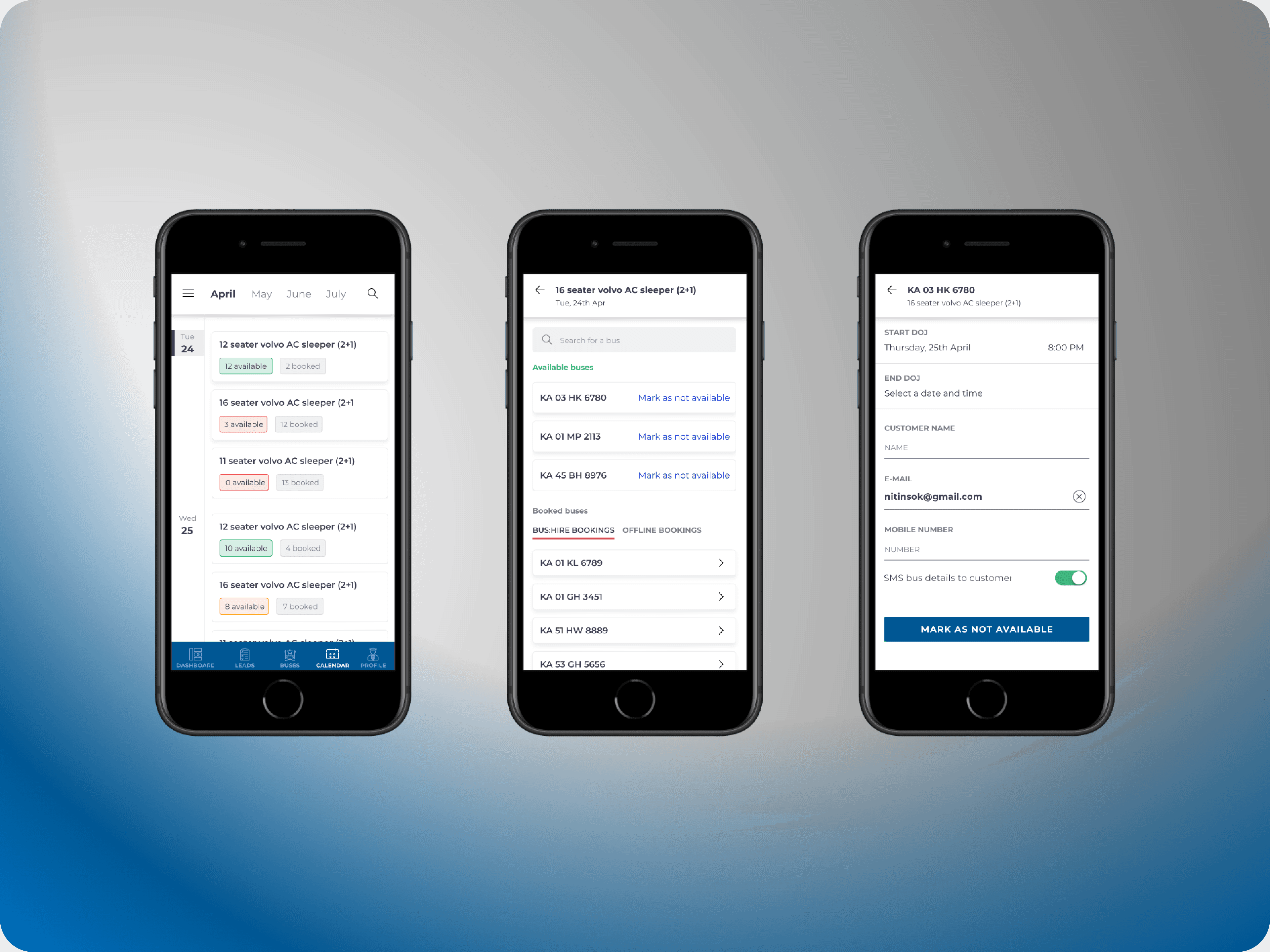
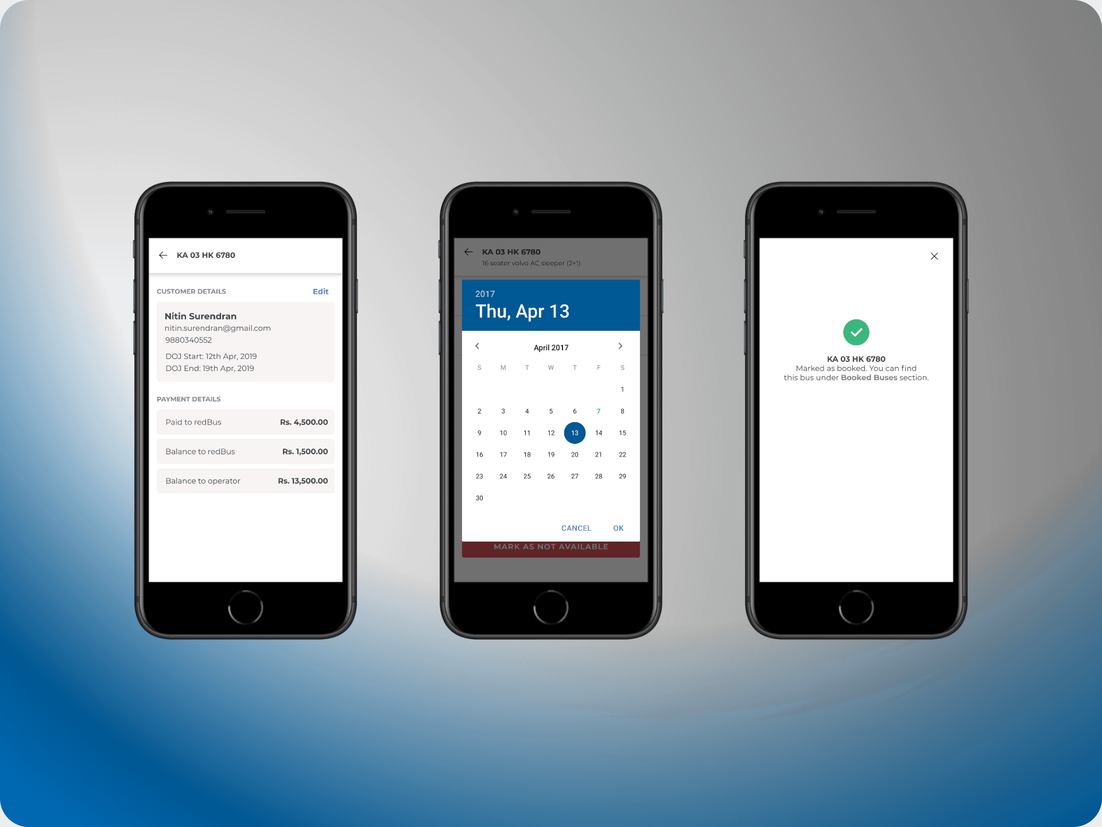
The calendar feature provides bus operators with a clear overview of how many buses are running on any given day. This tool is essential for managing fleets, allowing operators to quickly identify underutilized buses and make adjustments as needed. It offers a comprehensive view of bus operations over a week or month, helping operators efficiently manage their resources and optimize their schedules.
Adding Buses
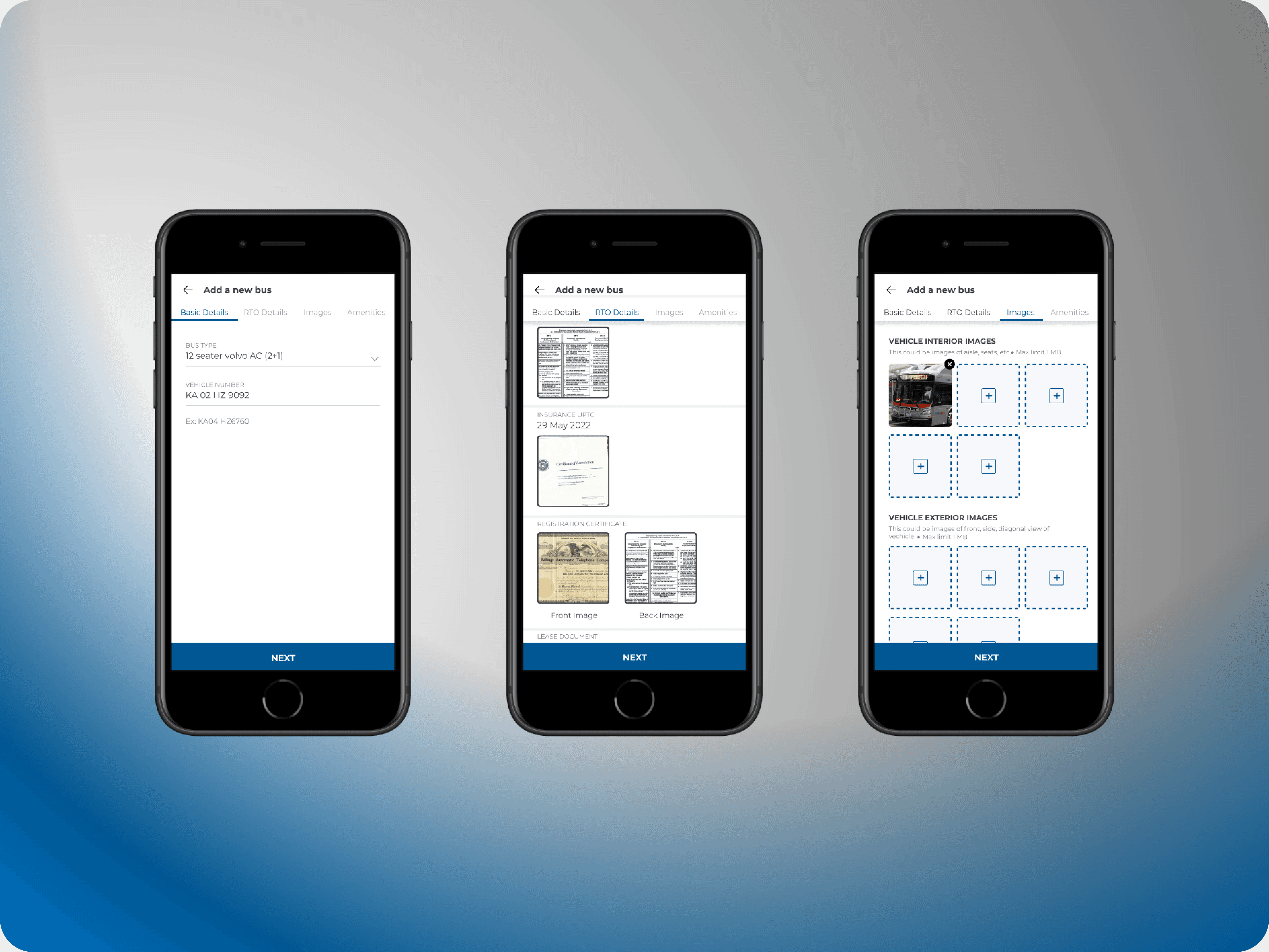
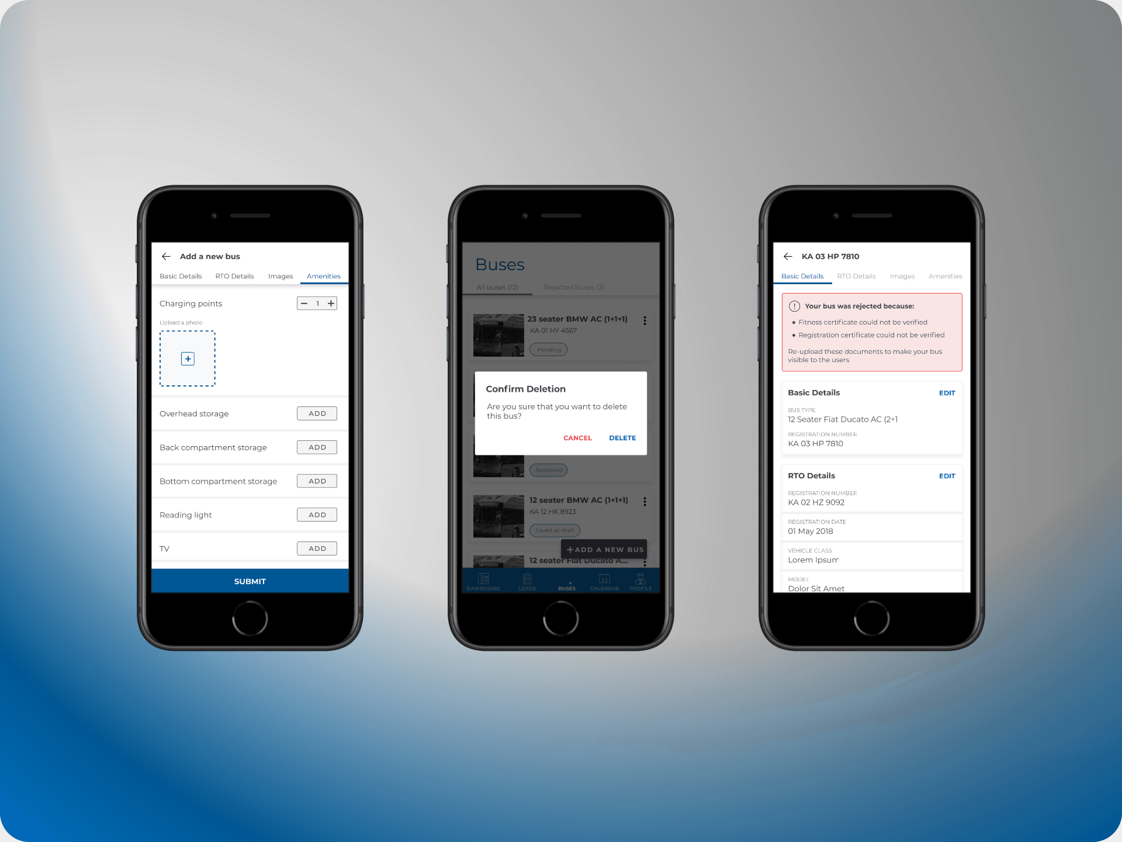
The new app empowers operators to add buses directly from their phones, streamlining the process into a few simple steps: entering basic details, providing RTO information, uploading images of the bus, and specifying available amenities. This feature enhances convenience and efficiency, making it easier for operators to manage their fleet on the go.
Manage Bookings
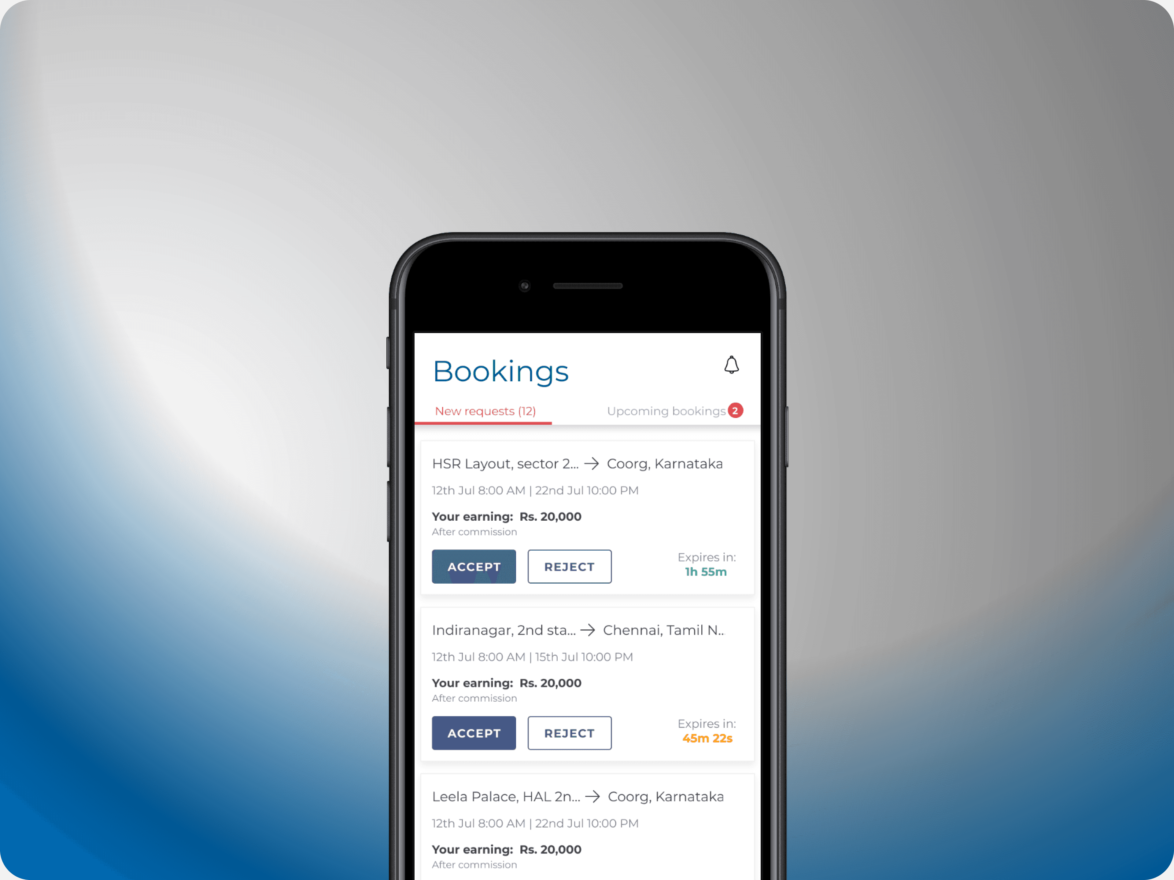
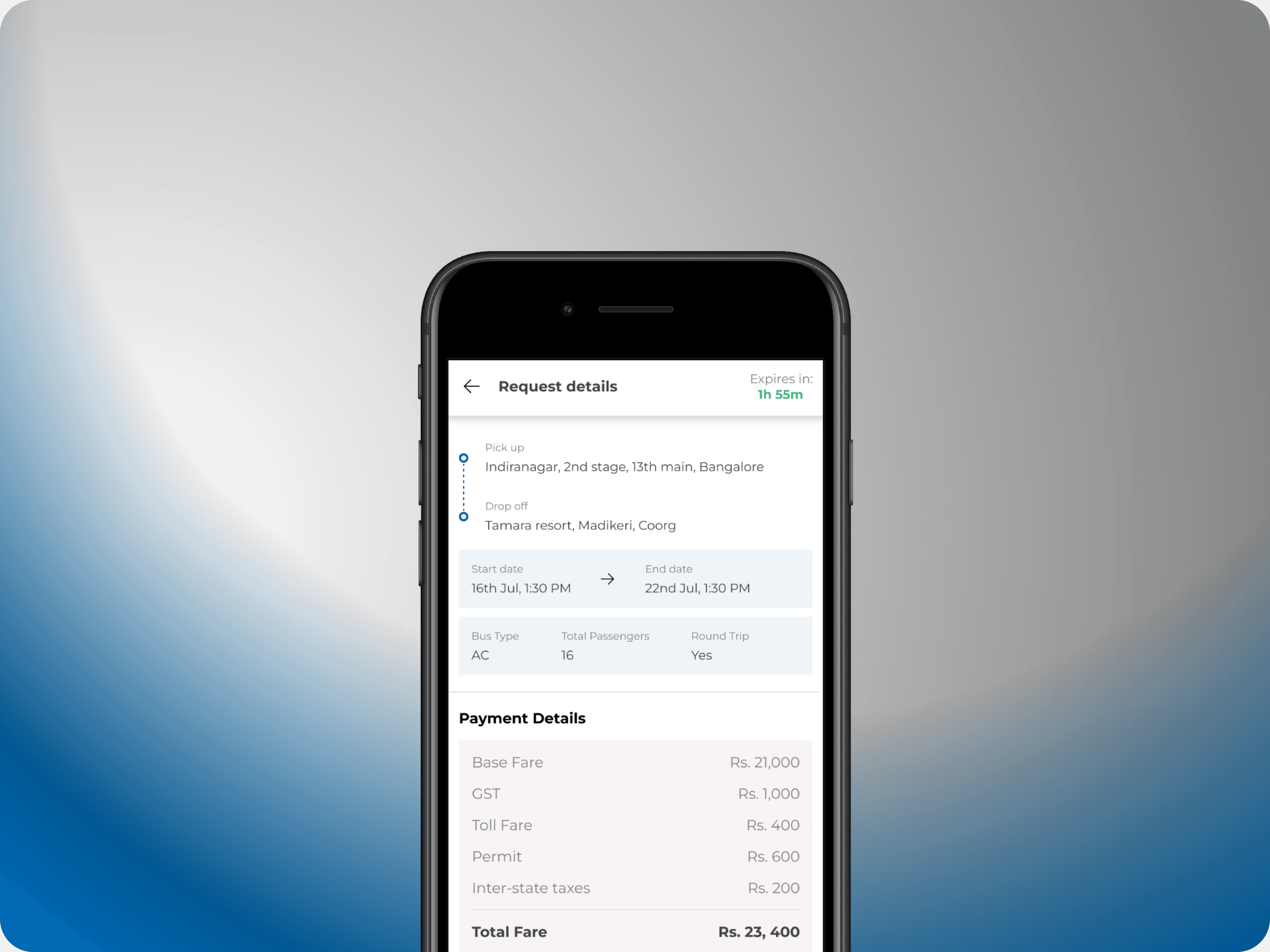
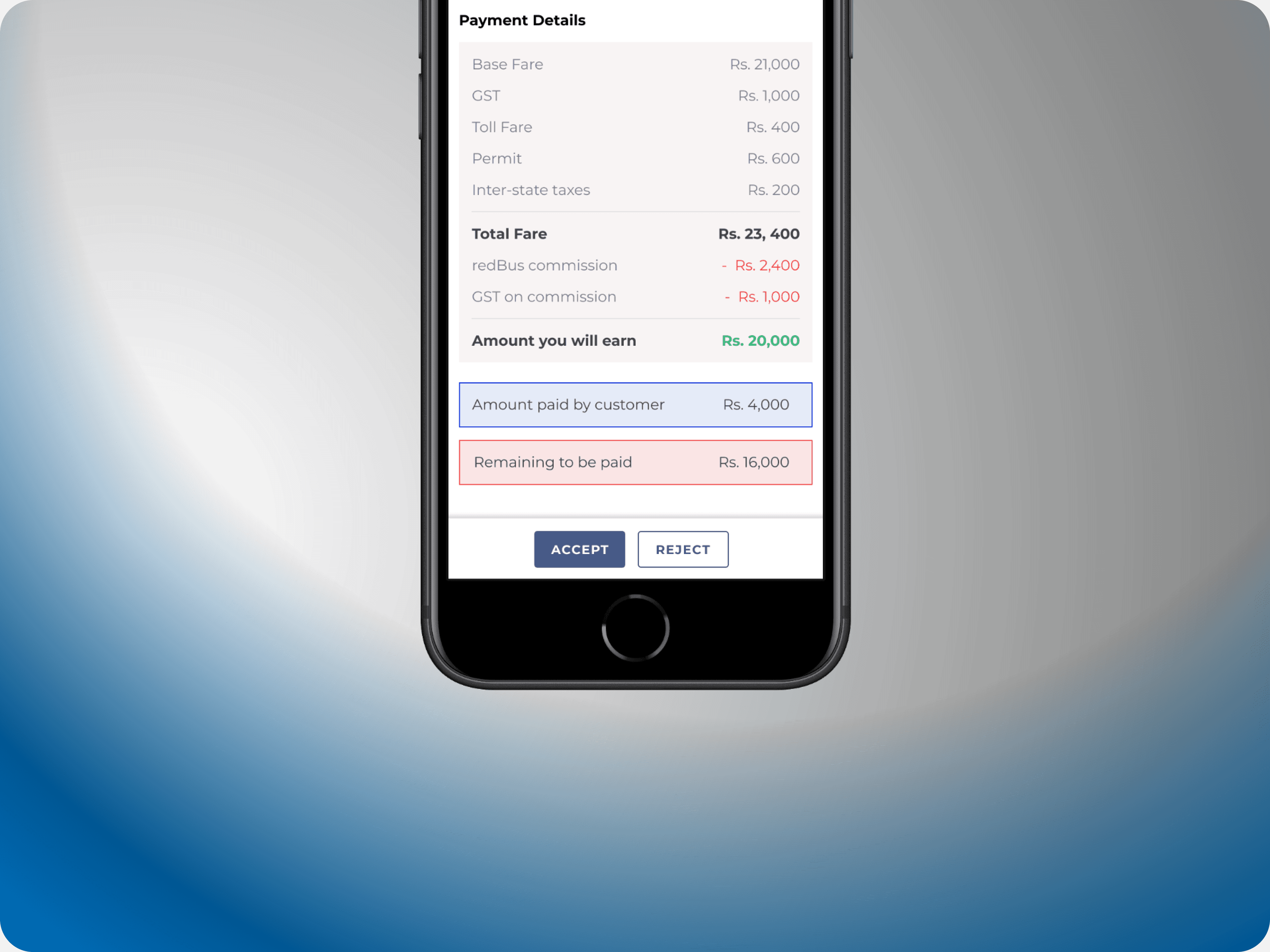
To increase the app's adoption, we introduced the ability to manage bookings on the go. When a user requests a bus, the request is sent to all relevant bus operators, who have a limited time to accept or reject it. This feature includes passenger details and displays the potential earnings for the operator, allowing for quick and informed decision-making.
Adding and Managing Drivers
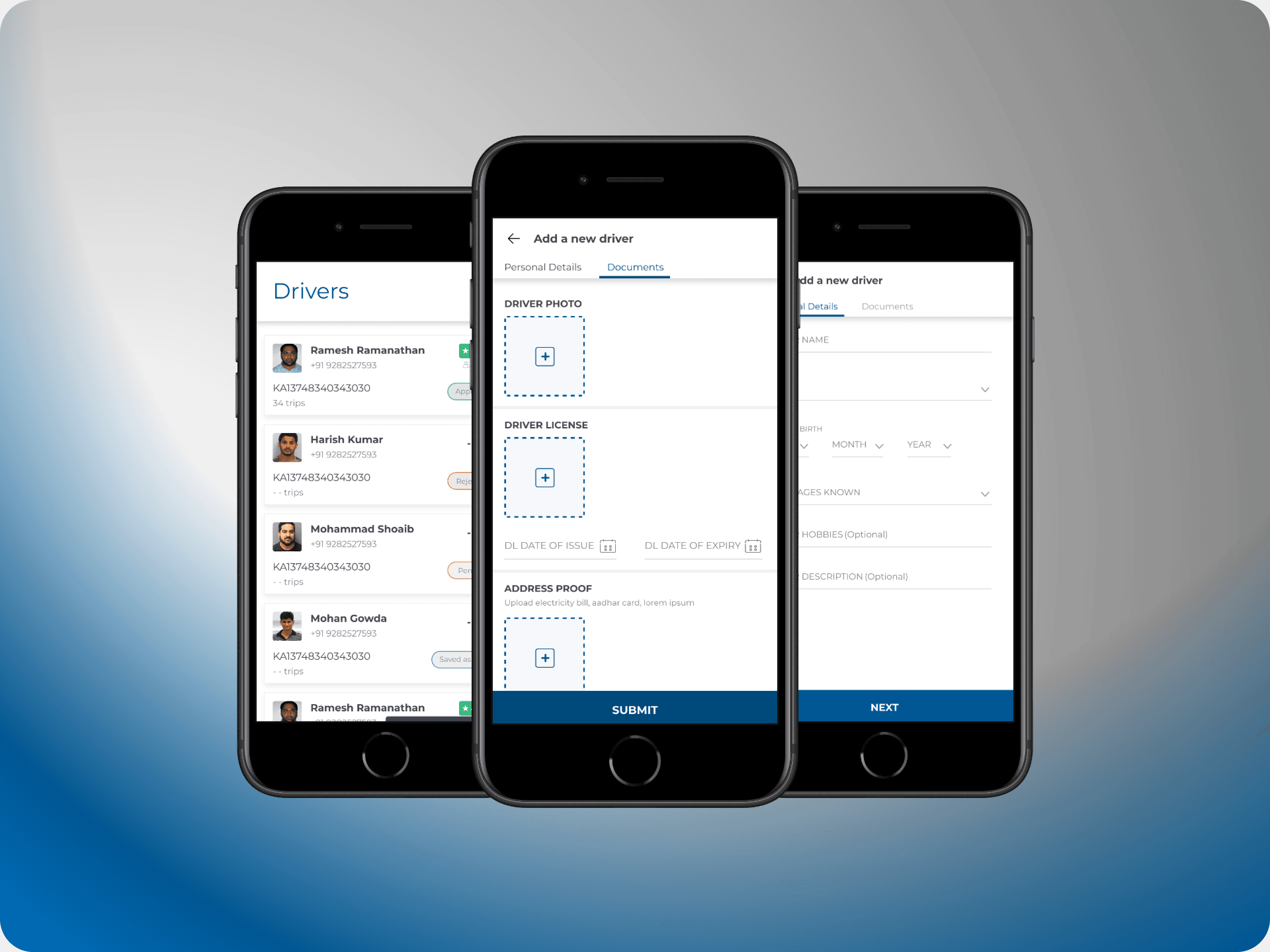
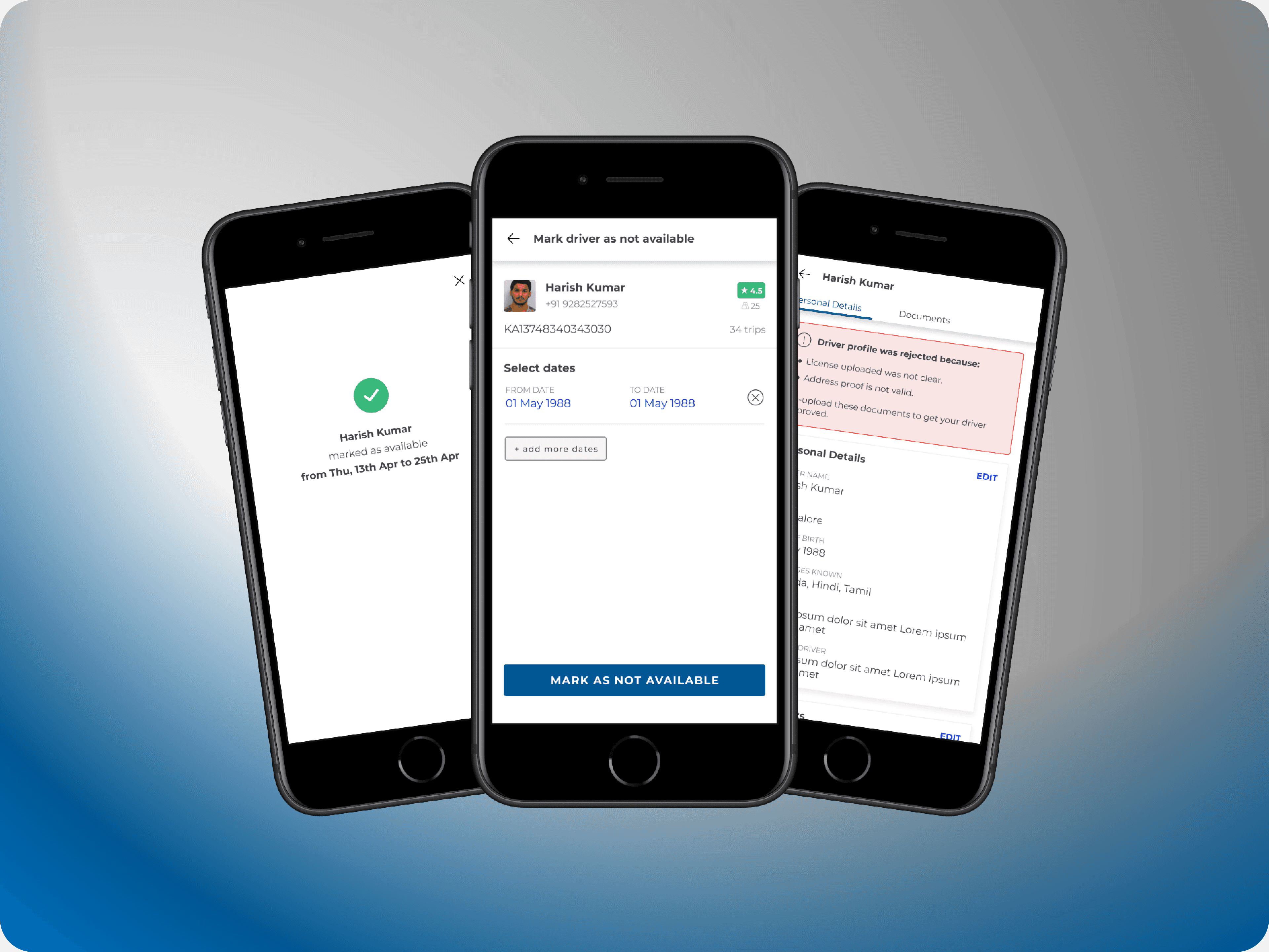
The app simplified the process of adding new drivers. Operators can now easily input driver details and upload the necessary documents directly from their phones, streamlining driver management and ensuring that all required information is readily available.


Case study #1- redBus app
This case study focuses on a comprehensive redesign of the redBus app, aimed not at a visual overhaul, but at significantly improving the user experience based on extensive research, customer feedback, data analysis, and interviews. My primary focus was on redesigning the booking experience, with particular attention to the search results page and the bus details page—two key areas that are critical to the user journey.
The redesign was driven by insights gathered directly from our users, allowing us to address pain points and enhance the overall usability of the app. By refining these crucial pages, the goal was to streamline the booking process, making it more intuitive and user-friendly, ultimately leading to a more satisfying experience for millions of redBus customers.
Key Highlights
Onboarding explorations
I delved into reimagining the app's onboarding experience, exploring how it could stand out and better engage users. Collaborating with talented illustrators, we envisioned a fresh visual direction for redBus. Here are some of the concepts we explored.

Search results
Redesigning the search results page presented a unique challenge: how to present all the essential information in a way that simplifies the decision-making process for users while also accommodating the needs of bus operators.
This redesign required a systems design approach to balance usability with the interests of bus operators, who each want to highlight their top features. The key was finding a way to integrate these elements seamlessly, ensuring the page remained user-friendly.
We introduced several enhancements, including a new "Offers" section, updated bus card elements, and improved filtering options. A significant innovation was the addition of persuasion tags. These tags, generated from data on city conditions, traffic, seasonal trends, and other key metrics, help guide users towards the most relevant and compelling options.


Bus Details
Providing comprehensive details about a bus was crucial, especially in a market like India where private transportation can vary significantly and users want assurance about their travel choices.
The redesigned bus details page aimed to address these needs by offering in-depth information about each bus operator and highlighting the unique features of their services. This page was crafted to not only showcase the operator’s specialties but also to transparently display the bus’s quality. Key elements included user-generated content such as ratings and reviews, along with high-quality images of the bus. This approach helps users make informed decisions and feel confident about their travel experience.


Case study #2- Bus:Hire
The introduction of the Bus Hire vertical marked redBus's expansion into a new market, aiming to digitize and streamline the process of renting buses for group travel. Traditionally, this market in India has been managed offline, with bus operators and travel agents negotiating quotes based on individual needs, involving extensive bargaining and trust-building, such as verifying driver details.
The challenge was to transition this complex, non-linear process into a digital platform. We designed a seamless experience that covers everything from the initial search to receiving quotes and paying in multiple installments. This digital solution represented a significant shift for the market, combining convenience and transparency in a space that had long relied on face-to-face interactions. The result was a unique and innovative approach to bus rental, addressing the specific needs and expectations of the users while modernizing the booking process.
Key Highlights
Homepage
Unlike redBus, the BusHire vertical was a newer concept and initially relied on a basic lead generation form to gather user inquiries for quotations. To better educate users about this new service, I redesigned the homepage into a detailed, long-scroll format. This new design breaks down each feature, providing comprehensive information to guide users through the BusHire experience and help them understand the value of the service.


Search
The search form for BusHire needed to inspire trust while addressing the common questions users typically ask bus operators. It was essential to capture the nuances of real-life conversations, answering questions like:
- Will the bus drop me back to my location?
- Can I pick up a friend on the way?
- Can different people be dropped off at different locations?
- What time will we reach, and how long will it take?
Additionally, the form had to accommodate various scenarios, such as outstation trips, local rentals, and airport transfers—each with its own unique set of challenges. For airport rentals, a critical feature was identifying the correct drop-off terminal, as many Indian airports have separate and distant terminals for international and domestic flights.


Search Results
Previously, customers would receive an overwhelming average of 10 quotes. The redesigned search results page streamlined this by limiting the display to the top 4 or 5 options, making decision-making much simpler. Key enhancements in the new design included:
- A ‘Trusted Service’ badge for verified bus operators.
- Upfront fare details with a detailed cost breakdown.
- A ‘Things to Keep in Mind’ section, which was previously buried in the terms and conditions.
- A new section displaying all buses assigned to the quote by the operator.
- Information about the drivers assigned to the route, including reviews, age, trip history, and languages spoken.
Additionally, the quotation page retained essential elements like ratings, reviews, and cancellation policies from my earlier redesign of the redBus app, ensuring a consistent and user-friendly experience.


Payment
The booking flow for BusHire introduced a crucial feature not found in the redBus app: the option to pay a partial amount upfront or settle the full payment at once. This addition was a direct response to user feedback gathered during our research, addressing the specific needs of customers who preferred flexible payment options for their bookings.


Case Study #3- Desktop Booking Experience
This case study highlights my role in redesigning the booking experience for redBus. Tasked with improving the user experience across multiple geographies, including India, Singapore, Malaysia, Peru, and Colombia, I was responsible for designing the complete user flow—from search to seat selection to booking—for 23 million active users worldwide.
Lacking a dedicated user research team, I relied on a combination of self-directed research and insights gathered from product managers who worked closely with local teams in Southeast Asia and Latin America. My research approach, while unconventional, involved analyzing a range of sources, from cultural content to firsthand accounts, to develop a user-centered design strategy.

Key Highlights
Ease of Access:
Users could now edit their boarding and drop-off points directly within the booking flow, without the need to return to the home page. This feature was particularly important for a country like India, where each route often has numerous pick-up and drop-off locations. It streamlined the selection process, making it easier for users to find and choose the most convenient options.

Reforming Behaviours
Users no longer needed to repeat the entire search and booking process for a return journey. The "Add a Return Ticket" feature streamlined the experience, allowing users to book both their outbound and return trips simultaneously, saving time and making the process more efficient.


Reducing Cognitive Load
Data showed that users primarily focused on price, rating, and timings when booking a bus. To simplify the decision-making process, secondary details were hidden and only revealed on hover, allowing users to concentrate on the most important factors without being overwhelmed by information.

Streamlined Filtering for Faster Decisions
Previously tucked away under a tab, filters were brought to the forefront on the main page. This change led to a 17% increase in filter usage, enabling users to narrow down their options and make decisions more quickly and efficiently.


Some other key screens


Case Study #4- Bus Driver app
The redPro Hire app was developed to provide an efficient mobile solution for drivers and bus owners engaged with bookings, payments, and cancellations. Initially a desktop-only platform, the need for a mobile app became evident to facilitate on-the-go task management.
The app offers a range of functionalities, including a dashboard for quick summaries, the ability to add new buses, and assign drivers. Designed with the user base in mind—primarily individuals with limited technical proficiency who are familiar with the existing desktop application—the app aims to deliver a user-friendly experience that complements and enhances the desktop platform.

Key Highlights
Calendar
The calendar feature provides bus operators with a clear overview of how many buses are running on any given day. This tool is essential for managing fleets, allowing operators to quickly identify underutilized buses and make adjustments as needed. It offers a comprehensive view of bus operations over a week or month, helping operators efficiently manage their resources and optimize their schedules.


Adding Buses
The new app empowers operators to add buses directly from their phones, streamlining the process into a few simple steps: entering basic details, providing RTO information, uploading images of the bus, and specifying available amenities. This feature enhances convenience and efficiency, making it easier for operators to manage their fleet on the go.


Manage Bookings
To increase the app's adoption, we introduced the ability to manage bookings on the go. When a user requests a bus, the request is sent to all relevant bus operators, who have a limited time to accept or reject it. This feature includes passenger details and displays the potential earnings for the operator, allowing for quick and informed decision-making.


Adding and Managing Drivers
The app simplified the process of adding new drivers. Operators can now easily input driver details and upload the necessary documents directly from their phones, streamlining driver management and ensuring that all required information is readily available.


Case study #1- redBus app
This case study focuses on a comprehensive redesign of the redBus app, aimed not at a visual overhaul, but at significantly improving the user experience based on extensive research, customer feedback, data analysis, and interviews. My primary focus was on redesigning the booking experience, with particular attention to the search results page and the bus details page—two key areas that are critical to the user journey.
The redesign was driven by insights gathered directly from our users, allowing us to address pain points and enhance the overall usability of the app. By refining these crucial pages, the goal was to streamline the booking process, making it more intuitive and user-friendly, ultimately leading to a more satisfying experience for millions of redBus customers.
Key Highlights
Onboarding explorations
I delved into reimagining the app's onboarding experience, exploring how it could stand out and better engage users. Collaborating with talented illustrators, we envisioned a fresh visual direction for redBus. Here are some of the concepts we explored.

Search results
Redesigning the search results page presented a unique challenge: how to present all the essential information in a way that simplifies the decision-making process for users while also accommodating the needs of bus operators.
This redesign required a systems design approach to balance usability with the interests of bus operators, who each want to highlight their top features. The key was finding a way to integrate these elements seamlessly, ensuring the page remained user-friendly.
We introduced several enhancements, including a new "Offers" section, updated bus card elements, and improved filtering options. A significant innovation was the addition of persuasion tags. These tags, generated from data on city conditions, traffic, seasonal trends, and other key metrics, help guide users towards the most relevant and compelling options.


Bus Details
Providing comprehensive details about a bus was crucial, especially in a market like India where private transportation can vary significantly and users want assurance about their travel choices.
The redesigned bus details page aimed to address these needs by offering in-depth information about each bus operator and highlighting the unique features of their services. This page was crafted to not only showcase the operator’s specialties but also to transparently display the bus’s quality. Key elements included user-generated content such as ratings and reviews, along with high-quality images of the bus. This approach helps users make informed decisions and feel confident about their travel experience.


Case study #2- Bus:Hire
The introduction of the Bus Hire vertical marked redBus's expansion into a new market, aiming to digitize and streamline the process of renting buses for group travel. Traditionally, this market in India has been managed offline, with bus operators and travel agents negotiating quotes based on individual needs, involving extensive bargaining and trust-building, such as verifying driver details.
The challenge was to transition this complex, non-linear process into a digital platform. We designed a seamless experience that covers everything from the initial search to receiving quotes and paying in multiple installments. This digital solution represented a significant shift for the market, combining convenience and transparency in a space that had long relied on face-to-face interactions. The result was a unique and innovative approach to bus rental, addressing the specific needs and expectations of the users while modernizing the booking process.
Key Highlights
Homepage
Unlike redBus, the BusHire vertical was a newer concept and initially relied on a basic lead generation form to gather user inquiries for quotations. To better educate users about this new service, I redesigned the homepage into a detailed, long-scroll format. This new design breaks down each feature, providing comprehensive information to guide users through the BusHire experience and help them understand the value of the service.


Search
The search form for BusHire needed to inspire trust while addressing the common questions users typically ask bus operators. It was essential to capture the nuances of real-life conversations, answering questions like:
- Will the bus drop me back to my location?
- Can I pick up a friend on the way?
- Can different people be dropped off at different locations?
- What time will we reach, and how long will it take?
Additionally, the form had to accommodate various scenarios, such as outstation trips, local rentals, and airport transfers—each with its own unique set of challenges. For airport rentals, a critical feature was identifying the correct drop-off terminal, as many Indian airports have separate and distant terminals for international and domestic flights.


Search Results
Previously, customers would receive an overwhelming average of 10 quotes. The redesigned search results page streamlined this by limiting the display to the top 4 or 5 options, making decision-making much simpler. Key enhancements in the new design included:
- A ‘Trusted Service’ badge for verified bus operators.
- Upfront fare details with a detailed cost breakdown.
- A ‘Things to Keep in Mind’ section, which was previously buried in the terms and conditions.
- A new section displaying all buses assigned to the quote by the operator.
- Information about the drivers assigned to the route, including reviews, age, trip history, and languages spoken.
Additionally, the quotation page retained essential elements like ratings, reviews, and cancellation policies from my earlier redesign of the redBus app, ensuring a consistent and user-friendly experience.


Payment
The booking flow for BusHire introduced a crucial feature not found in the redBus app: the option to pay a partial amount upfront or settle the full payment at once. This addition was a direct response to user feedback gathered during our research, addressing the specific needs of customers who preferred flexible payment options for their bookings.


Case Study #3- Desktop Booking Experience
This case study highlights my role in redesigning the booking experience for redBus. Tasked with improving the user experience across multiple geographies, including India, Singapore, Malaysia, Peru, and Colombia, I was responsible for designing the complete user flow—from search to seat selection to booking—for 23 million active users worldwide.
Lacking a dedicated user research team, I relied on a combination of self-directed research and insights gathered from product managers who worked closely with local teams in Southeast Asia and Latin America. My research approach, while unconventional, involved analyzing a range of sources, from cultural content to firsthand accounts, to develop a user-centered design strategy.

Key Highlights
Ease of Access:
Users could now edit their boarding and drop-off points directly within the booking flow, without the need to return to the home page. This feature was particularly important for a country like India, where each route often has numerous pick-up and drop-off locations. It streamlined the selection process, making it easier for users to find and choose the most convenient options.

Reforming Behaviours
Users no longer needed to repeat the entire search and booking process for a return journey. The "Add a Return Ticket" feature streamlined the experience, allowing users to book both their outbound and return trips simultaneously, saving time and making the process more efficient.


Reducing Cognitive Load
Data showed that users primarily focused on price, rating, and timings when booking a bus. To simplify the decision-making process, secondary details were hidden and only revealed on hover, allowing users to concentrate on the most important factors without being overwhelmed by information.

Streamlined Filtering for Faster Decisions
Previously tucked away under a tab, filters were brought to the forefront on the main page. This change led to a 17% increase in filter usage, enabling users to narrow down their options and make decisions more quickly and efficiently.


Some other key screens


Case Study #4- Bus Driver app
The redPro Hire app was developed to provide an efficient mobile solution for drivers and bus owners engaged with bookings, payments, and cancellations. Initially a desktop-only platform, the need for a mobile app became evident to facilitate on-the-go task management.
The app offers a range of functionalities, including a dashboard for quick summaries, the ability to add new buses, and assign drivers. Designed with the user base in mind—primarily individuals with limited technical proficiency who are familiar with the existing desktop application—the app aims to deliver a user-friendly experience that complements and enhances the desktop platform.

Key Highlights
Calendar
The calendar feature provides bus operators with a clear overview of how many buses are running on any given day. This tool is essential for managing fleets, allowing operators to quickly identify underutilized buses and make adjustments as needed. It offers a comprehensive view of bus operations over a week or month, helping operators efficiently manage their resources and optimize their schedules.


Adding Buses
The new app empowers operators to add buses directly from their phones, streamlining the process into a few simple steps: entering basic details, providing RTO information, uploading images of the bus, and specifying available amenities. This feature enhances convenience and efficiency, making it easier for operators to manage their fleet on the go.


Manage Bookings
To increase the app's adoption, we introduced the ability to manage bookings on the go. When a user requests a bus, the request is sent to all relevant bus operators, who have a limited time to accept or reject it. This feature includes passenger details and displays the potential earnings for the operator, allowing for quick and informed decision-making.


Adding and Managing Drivers
The app simplified the process of adding new drivers. Operators can now easily input driver details and upload the necessary documents directly from their phones, streamlining driver management and ensuring that all required information is readily available.


Case study #1- redBus app
This case study focuses on a comprehensive redesign of the redBus app, aimed not at a visual overhaul, but at significantly improving the user experience based on extensive research, customer feedback, data analysis, and interviews. My primary focus was on redesigning the booking experience, with particular attention to the search results page and the bus details page—two key areas that are critical to the user journey.
The redesign was driven by insights gathered directly from our users, allowing us to address pain points and enhance the overall usability of the app. By refining these crucial pages, the goal was to streamline the booking process, making it more intuitive and user-friendly, ultimately leading to a more satisfying experience for millions of redBus customers.
Key Highlights
Onboarding explorations
I delved into reimagining the app's onboarding experience, exploring how it could stand out and better engage users. Collaborating with talented illustrators, we envisioned a fresh visual direction for redBus. Here are some of the concepts we explored.

Search results
Redesigning the search results page presented a unique challenge: how to present all the essential information in a way that simplifies the decision-making process for users while also accommodating the needs of bus operators.
This redesign required a systems design approach to balance usability with the interests of bus operators, who each want to highlight their top features. The key was finding a way to integrate these elements seamlessly, ensuring the page remained user-friendly.
We introduced several enhancements, including a new "Offers" section, updated bus card elements, and improved filtering options. A significant innovation was the addition of persuasion tags. These tags, generated from data on city conditions, traffic, seasonal trends, and other key metrics, help guide users towards the most relevant and compelling options.


Bus Details
Providing comprehensive details about a bus was crucial, especially in a market like India where private transportation can vary significantly and users want assurance about their travel choices.
The redesigned bus details page aimed to address these needs by offering in-depth information about each bus operator and highlighting the unique features of their services. This page was crafted to not only showcase the operator’s specialties but also to transparently display the bus’s quality. Key elements included user-generated content such as ratings and reviews, along with high-quality images of the bus. This approach helps users make informed decisions and feel confident about their travel experience.


Case study #2- Bus:Hire
The introduction of the Bus Hire vertical marked redBus's expansion into a new market, aiming to digitize and streamline the process of renting buses for group travel. Traditionally, this market in India has been managed offline, with bus operators and travel agents negotiating quotes based on individual needs, involving extensive bargaining and trust-building, such as verifying driver details.
The challenge was to transition this complex, non-linear process into a digital platform. We designed a seamless experience that covers everything from the initial search to receiving quotes and paying in multiple installments. This digital solution represented a significant shift for the market, combining convenience and transparency in a space that had long relied on face-to-face interactions. The result was a unique and innovative approach to bus rental, addressing the specific needs and expectations of the users while modernizing the booking process.
Key Highlights
Homepage
Unlike redBus, the BusHire vertical was a newer concept and initially relied on a basic lead generation form to gather user inquiries for quotations. To better educate users about this new service, I redesigned the homepage into a detailed, long-scroll format. This new design breaks down each feature, providing comprehensive information to guide users through the BusHire experience and help them understand the value of the service.


Search
The search form for BusHire needed to inspire trust while addressing the common questions users typically ask bus operators. It was essential to capture the nuances of real-life conversations, answering questions like:
- Will the bus drop me back to my location?
- Can I pick up a friend on the way?
- Can different people be dropped off at different locations?
- What time will we reach, and how long will it take?
Additionally, the form had to accommodate various scenarios, such as outstation trips, local rentals, and airport transfers—each with its own unique set of challenges. For airport rentals, a critical feature was identifying the correct drop-off terminal, as many Indian airports have separate and distant terminals for international and domestic flights.


Search Results
Previously, customers would receive an overwhelming average of 10 quotes. The redesigned search results page streamlined this by limiting the display to the top 4 or 5 options, making decision-making much simpler. Key enhancements in the new design included:
- A ‘Trusted Service’ badge for verified bus operators.
- Upfront fare details with a detailed cost breakdown.
- A ‘Things to Keep in Mind’ section, which was previously buried in the terms and conditions.
- A new section displaying all buses assigned to the quote by the operator.
- Information about the drivers assigned to the route, including reviews, age, trip history, and languages spoken.
Additionally, the quotation page retained essential elements like ratings, reviews, and cancellation policies from my earlier redesign of the redBus app, ensuring a consistent and user-friendly experience.


Payment
The booking flow for BusHire introduced a crucial feature not found in the redBus app: the option to pay a partial amount upfront or settle the full payment at once. This addition was a direct response to user feedback gathered during our research, addressing the specific needs of customers who preferred flexible payment options for their bookings.


Case Study #3- Desktop Booking Experience
This case study highlights my role in redesigning the booking experience for redBus. Tasked with improving the user experience across multiple geographies, including India, Singapore, Malaysia, Peru, and Colombia, I was responsible for designing the complete user flow—from search to seat selection to booking—for 23 million active users worldwide.
Lacking a dedicated user research team, I relied on a combination of self-directed research and insights gathered from product managers who worked closely with local teams in Southeast Asia and Latin America. My research approach, while unconventional, involved analyzing a range of sources, from cultural content to firsthand accounts, to develop a user-centered design strategy.

Key Highlights
Ease of Access:
Users could now edit their boarding and drop-off points directly within the booking flow, without the need to return to the home page. This feature was particularly important for a country like India, where each route often has numerous pick-up and drop-off locations. It streamlined the selection process, making it easier for users to find and choose the most convenient options.

Reforming Behaviours
Users no longer needed to repeat the entire search and booking process for a return journey. The "Add a Return Ticket" feature streamlined the experience, allowing users to book both their outbound and return trips simultaneously, saving time and making the process more efficient.


Reducing Cognitive Load
Data showed that users primarily focused on price, rating, and timings when booking a bus. To simplify the decision-making process, secondary details were hidden and only revealed on hover, allowing users to concentrate on the most important factors without being overwhelmed by information.

Streamlined Filtering for Faster Decisions
Previously tucked away under a tab, filters were brought to the forefront on the main page. This change led to a 17% increase in filter usage, enabling users to narrow down their options and make decisions more quickly and efficiently.


Some other key screens


Case Study #4- Bus Driver app
The redPro Hire app was developed to provide an efficient mobile solution for drivers and bus owners engaged with bookings, payments, and cancellations. Initially a desktop-only platform, the need for a mobile app became evident to facilitate on-the-go task management.
The app offers a range of functionalities, including a dashboard for quick summaries, the ability to add new buses, and assign drivers. Designed with the user base in mind—primarily individuals with limited technical proficiency who are familiar with the existing desktop application—the app aims to deliver a user-friendly experience that complements and enhances the desktop platform.

Key Highlights
Calendar
The calendar feature provides bus operators with a clear overview of how many buses are running on any given day. This tool is essential for managing fleets, allowing operators to quickly identify underutilized buses and make adjustments as needed. It offers a comprehensive view of bus operations over a week or month, helping operators efficiently manage their resources and optimize their schedules.


Adding Buses
The new app empowers operators to add buses directly from their phones, streamlining the process into a few simple steps: entering basic details, providing RTO information, uploading images of the bus, and specifying available amenities. This feature enhances convenience and efficiency, making it easier for operators to manage their fleet on the go.


Manage Bookings
To increase the app's adoption, we introduced the ability to manage bookings on the go. When a user requests a bus, the request is sent to all relevant bus operators, who have a limited time to accept or reject it. This feature includes passenger details and displays the potential earnings for the operator, allowing for quick and informed decision-making.


Adding and Managing Drivers
The app simplified the process of adding new drivers. Operators can now easily input driver details and upload the necessary documents directly from their phones, streamlining driver management and ensuring that all required information is readily available.
